This is another addition to our ongoing series of tutorials and case studies on landing pages that work.
It occurred to me late last year, as I was readying yet another Landing Page Makeover, that the end of one year and the beginning of the next was a good time to do a “Where are they now?” post. So first things first, I went back and contacted all makeover participants from the very beginning of the series.
Of the more than 20 contacted, I learned that one is no longer in business, MagicPumpkinArt.com (Makeover #14) and two are in the midst of developing new products or revising their focus: TheLast10lbs.com (Makeover #4) and 4PsofPodcasting.com (Makeover #9).
The rest? Well, most did not respond to our request for follow-up details. (This is me sad :() But of those who did, I think you’ll find their answers interesting and their results encouraging. Here are the questions I posed:
- Did you implement all/some/few or none of the recommendations made about your website?
- If yes, did you see any tangible results — increased traffic, sign ups, conversions, sales? Were the results the same, better or worse after making the changes? Which changes produced the biggest results and why?
- If no, what were the primary reasons? Was it a matter of time or cost to implement? Something else? Did you simply disagree with the recommendations? (Be honest, I can take it.)
- Is there anything I could have done differently in preparing the makeover to be more useful to you, your business or your website?
And here are the responses I received (lightly edited for length):
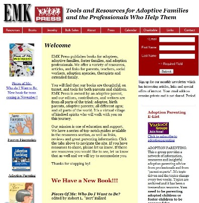
From Carrie Kitze, EMKPress.com (Landing Page Makeover #6)
We were poised to do a redesign when Roberta took a look at our site. Her suggestions were on point and helped us streamline and reorganize the site.
- We moved to a three column format and made more things clickable.
- Each product now has its own page and our resources are more organized for different types of readers to find. (It’s also just cleaner looking.)
- Our articles have been linked to by a variety of blogs/forums and when we note that an article has become popular to download, we cross sell products based on the demographics that are hitting that part of the site.
Results:
- We have seen a 50% increase in traffic to the site. Now more organized and informational, the site has given us more credibility in a cluttered landscape. We’ve seen an increase in article linking by adoption agencies and professionals, as well.
I would have liked to implement more recommendations but time and budget (mostly time since we are a small office) precluded us from doing more. Just re-reading her suggestions gives me additional ideas on tightening things up in the next few months as we add some additional resources.
Roberta’s suggestions were spot-on and many were easy to implement with measurable results.
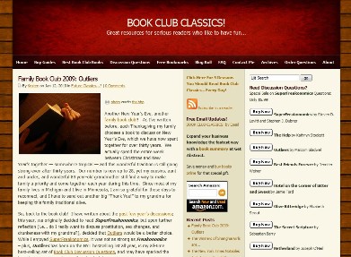
From Kristen Galles, BookClubClassics.com (Marketing Plan Makeover #2 )
I implemented every single suggestion. Her review sparked comments that led to a great discussion about the focus of my website, too.
Initially, when I first created BookClubClassics, I was most interested in selling customized book club discussion guides. However, after Roberta’s review, I realized that this would be a very time-consuming and inefficient way to make money. The guides required hours to create, and the availability of free discussion questions from publishers made my guides a “tough sell.” So, I stopped creating the guides and focused on increasing my readership instead.
Now I have time to create discussion questions (instead of full discussion guides) for those clubs who want guides with more substantial questions. These questions actually sell better than the full guides did!
In addition to Roberta’s general recommendations, her specific detail-oriented suggestions regarding the lay-out and presentation of my website were invaluable as well.
Results:
- Each month my readership continues to increase, as do my affiliate earnings.
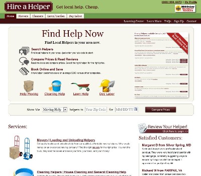
From Daniel Horning, Marketing Director, HireAHelper.com (Landing Page Makeover #5)
We implemented most of Roberta’s suggestions. Specifically:
- We added more content to our customer review system and added a link to “HireAHelper Protects You. Find out How.” with details about the customer’s transaction and our 100% refund policy.
- We added a list of customer reviews to the homepage, landing pages and trust elements. Our BBB logo is now in the top right hand corner of all our pages.
- Although Roberta felt that the term, “Day Labor” carries a bit of a negative connotation, we decided to keep it. However, we added more language using “General Help” and “Handyman” and that has helped.
- We applied the five-line max paragraph rule and white space recommendation to many of our pages. We also fixed misspellings and have a content review system in place in our office. Our logo is now clickable back to the homepage across the whole site.
Recommendations not implemented:
- We considered a new tagline but decided to stick with “Get Local Help. Cheap.” Adding anything to it would have diluted the importance of our 2 main points — local and cheap.
- We decided not to include specifics about our customer counts. However, we may revisit this suggestion to continue to boost and support customer confidence in the site, as well as add possible package plans.
Results:
- Our customers gained a clearer understanding of our service offerings, especially once they saw the customer reviews posted on the homepage/landing pages.
- It’s hard to track the impact that paragraph line counts and white space have on customers directly, but we definitely saw huge growth in the months after the recommendations both in an increase in visitors and an increase in how long they stayed on the site.
- We also saw an increase in the conversion rate to just above 6% the first month of 2008 and averaged around 4% throughout the rest of the year.
- The suggestions provided are still useful in our planning and development today.
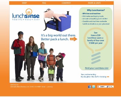
From Nancy Owen Myers, Lunchsense.com (Landing Page Makeover #19)
Roberta said:
Simplify the homepage!
I did rework the home page. It launches soon.
Choose one primary image that’s representative of everything else.
I used a whole family!
Choose one strong statement.
I went with — “It’s a big world! Better pack a lunch.” This and the whole family image convey that everyone can use this lunchbox.
Rework the navigation and rethink the color scheme.
I did a bunch of things simultaneously when this makeover went up — planned, scheduled, and undertook photography, started to work on new packaging, and reworked the website navigation, too.
Recommendations not implemented:
Test offers — free shipping, discounting, bundling.
I struggle with this as I’m philosophically opposed to “Buy this and get MORE! — but what if I don’t NEED more? That said, I do offer occasional percentage discounts and I can offer free shipping and such offers as appropriate. But I can’t run my biz on that.
Results:
- Overall, though, I think the recommendations were generally very good, and if nothing else I’m happier with my site.
- I often go in and tweak stuff in the website, and make sure I go through my site page by page every so often to make sure it all hangs together. Roberta’s makeover really helped me make that a priority.
(Roberta’s note — I’ll revisit with Nancy once her redesigned store is live.)
Roberta’s takeaways (and yours)
- You don’t have to make large, wholesale changes all at once, but do try and pick the elements that have the most potential for big impact, like testing headlines, adding additional calls to action, and editing content for better readability.
- Even small changes can make a difference — try testing text in your call to action links and buttons. You’d be amazed at the difference you’ll see between Buy Now, Join Now, or Find Out More Now.
- Push your value proposition forward while embracing your market reality. If there’s a lot of competition for your products/services, find what’s unique about yours — what only you can say — and get it out there. Be opening to reframing your goals as you learn more.
And lastly — Marketing is a process. Always be testing.
I do want to thank all the previous Maven Makeover participants who shared their findings with me (and those that didn’t, we know who you are.)
These brave souls subjected themselves to Roberta’s special brand of “tough marketing love” in a hugely popular public venue — and even paid for the privilege with a donation to Heifer International.
There’s a lot more to come in 2010 . . . so please stay tuned.
Additional note: As I was writing this post, news came in about the devastating earthquake in Haiti. If you’re a fan of my Maven Makeover series and have learned a little something along the way, please “pay it forward” and make a generous donation today to the International Committee of the Red Cross.
Here’s your chance to be the Copywriting Maven’s next landing page makeover!
Got a landing page that’s more poop than pop? Willing to share with Copyblogger readers? Prepared to put a little of your own “skin in the game” for a Maven Makeover? Then click on Maven’s Landing Page Makeover page for all the details.
I’m booked for gratis “Heifer” critiques until 4/1/10. If you’re interested in a private critique/makeover or other services, please email me directly.

Reader Comments (19)
Roberta, as always, your suggestions are very good. I can’t wait for the next round. I am going to throw my own blog in the mix as well, because I could really use some tips to gain increased readership and sign-ups (doesn’t everyone?)
-Joshua Black
Roberta… Thank you for this post… I really hope people take your point of testing and testing again… And once you think you’ve got something right, test it again… Everything from headlines, colors, text… you name it…
I don’t think marketing is a place for a perfectionist; it would drive them crazy…
Great post, but the truth is, and I don’t know about others, but I always skip over landing pages and look for the latest content. I really don’t care what the company has to say.
Mostly because they’re just pages trying to sell extra crap, or explaining about their company. But that’s just me, others might read them..just not my thing.
Great tips Roberta. I think we all have to realize that it’s important to keep striving to improve – our sites, our skills, our messaging… It’s too bad more people didn’t respond. I would’ve like to see more of how your recommendations impacted these businesses.
@Kyle, a landing page is normally designed to give the reader the information she needs when she’s ready to buy a product (or perhaps to make some other commitment, like sign up for a newsletter). Not to be confused with the home page.
It’s wonderful to see the follow-ups! Seeing the changes these sites have made gets the ideas flowing–and that’s the idea, right?
Thanks for the kind words all. Yes, that’s absolutely the idea, Linda, to help get ideas flowing and to show how my suggestions were fleshed out. I also wanted to show that sometimes my recommendations weren’t always taken for a variety of reasons.
@Kyle – Sonia detailed the difference between a homepage – which sometimes IS the landing page (and almost always shouldn’t be) and a sale or lead generation page very neatly. But as a direct marketing gal, I happen to like selling stuff.
Very informative and well worth the time to read. I especially liked the ‘Even small changes can make a difference’. I don’t think most people realise the impact of button statements. Look in the dictionary to see what ‘Submit’ actually means and then decide if you really want to use it. Maybe ‘Send’ is a better option.
Good post indeed.
More sound advice here. So agree that you don’t need to do anything but of you do something that’s a start. Fixing spelling mistakes, removing annoying flashy things or sounds and adding more calls to action are all low (or no) budget changes which will make a difference.
Thanks for the followups Roberta. They were very interesting. I’m always amazed at how sometimes the tiniest of tweaks can make such a difference in traffic and/or conversions – sometimes just a single word!
Brilliant post. I’m going to start using these questions immediately. It’s critical for your readers to get engaged and I have had trouble hearing back from them. I get frequent comments through email, but not back at the blog. This will help a lot. Just a little grease to spark the conversation. I can see how this will start something
Landing page may be very valuable for those in need. And for some people, including newbie would be a serious problem if they do not really understand about it.
I was shocked to read … “Well, most did not respond to our request for follow-up details.” This post is full of great information. Thanks!
Glad you found the information helpful, Jennifer!
Brilliant post. I’m going to start using these questions immediately. It’s critical for your readers to get engaged and I have had trouble hearing back from them. I get frequent comments through email, but not back at the blog. This will help a lot. Just a little grease to spark the conversation. I can see how this will start something
This article's comments are closed.