This is another addition to our ongoing series of tutorials and case studies on landing pages that work.
Is it hot in here or just me?
Diana Daffner and her husband want to help people find a renewed sense of joy and connection in their intimate relationships through tantra. Their business, IntimacyRetreats.com, offers couples retreats throughout the year, but realizing not everyone can attend a retreat, they also want to promote their books and media products.
The URL referenced above is actually the “/shop page” off their main site. Diana would like to use the page as an independent landing page, as well. So let’s take a look and see what we can do to warm up product sales for this tantra-loving business couple.
- The Goal: Increase sales of all products. (Some current sales may be being diverted to their Amazon listing.)
- The Problem: Good traffic flow, email list of several thousand prospects, less than 2% actually buy.
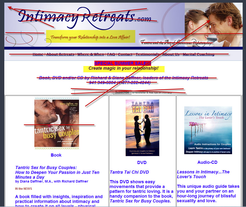
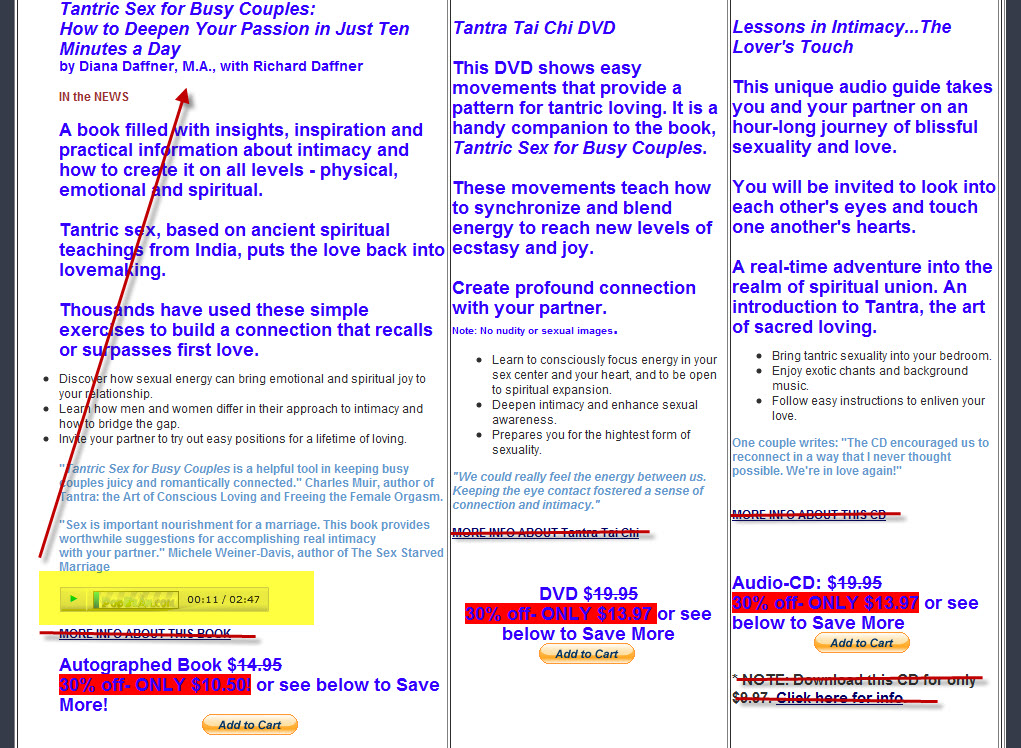
- The Current Landing Page:
http://TantricSexforBusy Couples.com - Value: $45.00 for the set:
The Maven’s 10-Point Critique
#1 — Treat this page as a standalone from the get-go.
If you want this page to be able to do its job properly, you need to think of it as a discrete entity — not just as an extension of your retreat offerings. It has to have all the usual landing page elements: a strong, emotionally-resonant headline, benefit-rich copy, attractive images, sweeteners like testimonials and purchase guarantees — and a clear call to action.
#2 — If you want to sell tantric-sex info products, your banner and messaging have to speak to tantric sex and not intimacy retreats.
You have too many taglines in the banner. I do like, however, “Transform your relationship into a love affair” and would highlight it, perhaps moving it into a pre-head position. I suggest you make the banner a little shorter to allow for more copy below. And yes, you have to say “Tantric Sex for Busy Couples” upfront. I like the product image and might use it in the banner rather than the one you’re using now.
#3 — Copy needs to reflect the original mindset of the visitor.
If visitors are coming to your home page looking for “couples workshop” then they’re not thinking DIY tantra at home. They may decide after they arrive that a workshop isn’t what they want right now and may look at other information, but it wasn’t top of mind originally.
Therefore your landing page copy has to acknowledge that in some way and position the products as a “If you can’t come to us, we’ll come to you” alternative.
#4 — If you want to sell information products, think about testing a pay-per-click campaign.
As noted above, your organic search visitors are knocking at your door looking for workshops. I’d strongly suggest testing a pay-per-click campaign based on the relevant keywords and phrases folks might use to find tantric sex info products for couples. Although I’d probably recommend testing different landing pages per male and female campaigns, one solid landing page that hits all the core points would be a good place to start.
#5 — Articulate the “big idea” behind your product offerings.
Tantra is a sort of “out there” practice to many people. Maybe they’ve heard about the supposed multi-hour tantric sessions between Sting and his wife, Trudy Styler, or that it requires lots of strange, uncomfortable positions — and what’s up with all the breathing and staring?
So what’s the big idea behind your tantric-sex info products? Probably something like this:
Tantric sex isn’t weird — it’s as easy as gazing into each other’s eyes and breathing. Everyone can do it, no matter how old or out of shape. Every relationship — from newlyweds to couples celebrating their golden anniversaries — can benefit from it. And we’re going to show you how to use it to regain your passion for your partner.
That’s the conceptual “big idea” umbrella under which all your specific products reside.
#6 – Consider the different personas — the different needs — of your visitors when crafting your copy.
My guess is your main site gets roughly three kinds of visitors:
- Happy couples who view a retreat as a special gift or vacation for themselves;
- Relatively happy couples who want to spice up their sexual relationship; and
- Unhappy couples who are looking for a way of fixing things.
Your product buyers are coming from groups #2 and #3, especially #3. Since pain relief is more of a motivator for action than pleasure-seeking, my guess is that most of these visitors are coming from the “fix” mindset. Men want to fix the sex and women want to fix the relationship, and maybe tantra is a solution to their mutual problem. (Thinking broadly, of course, because that’s what I do. Pun intended.)
Your headline/intro copy needs to promote your products as a smart, thoughtful, and effective first-step to solving intimacy issues. Copy needs to highlight “pain points” that both men and women would relate to and resonate with through their respective desire/gender lenses.
#7 — Ratchet up the sense of urgency.
Why does your prospective customer need this now? What is happening (or not) in their lives that they’re brought to searching for information to help them connect more passionately, genuinely with each other — and why get it from you?
Your intro and individual sales copy has to stay on point that what you’re offering will help relieve, solve, heal and help couples reconnect with each other. Make sure all copy is written in the ‘you’, the second person, to underscore your connection with the prospective buyer.
#8 — Trim the product copy to its scannable essence. Don’t use links to send visitors to other pages.
Your bulleted copy is good, it’s the paragraphs that are wordy and a little too “woo-woo,” especially for those whose relationships might be a little shaky and who might be unsure about tantra in general. Speak to your visitors in clear, clean prose that instills hope and confidence that you have what they need.
#9 — Redesign the page from the ground up.
Actually, I’d strongly suggest redesigning your entire site from the ground up. It looks amateurish and when it comes to folks spending, especially when every dollar counts, a polished and professional look will serve all your interests well.
Regarding the landing page, all the same good advice I generally offer applies here, too.
Get rid of all unnecessary distractions. If using a content management system for your site platform, then think about creating a static landing page that incorporates all the best practices. I’d suggest a two-column format — left wide, right narrow. Use the right column for testimonials, order details, and satisfaction guarantees, etc. The wider column handles the big marketing load. Use Verdana or Georgia for your font, black as your main font color, and use color for accent only. Clean up your product images. Make sure your images/content elements are balanced for a pleasing appearance.
You want to get the bulk of the key content in the first screen. Push your product shots left and add order buttons to the right with pricing and sale info. (You want a call to action in every screen.) Do get rid of the awful red highlighting. Also, for the main product and the CD, put the audio player either under the cover image or above the order button. Provide a meaningful caption to encourage folks to click and listen.
#10 – Use pop-up windows to provide additional information and still keep visitors on the page.
Right now you have “learn-more” links for each product that take them off the page to another longer product page. I don’t think this does you any more good than the shorter, more concise copy you have here. So if you want to add more info without making the copy longer, use the link to a pop-up window with whatever you think will aid the visitor’s ability to say yes to tantra and to a purchase.
I’d also think about using an exit pop-up to offer a sweetener — free shipping, perhaps — or to ask them for their name and email address in exchange for a free chapter, free music, or some other taste of your products. I’d create a second prospect list of potential product buyers (as opposed to just adding these names to your current list) and market accordingly.
My thanks to Diana Daffner for her patience and support of Heifer International. Look for my next makeover in approximately 4 weeks.
Want to get a future Copywriting Maven landing page makeover?
Got a landing page that’s more poop than pop? Willing to share with Copyblogger readers? Prepared to put a little of your own “skin in the game” for a Maven Makeover? Then follow your click to Maven’s Landing Page Makeover page for all the details.
I’m booked for gratis “Heifer” critiques until 01/16/2010. If you’re interested in a private critique/makeover or other services, please email me directly.
About the Author: Roberta Rosenberg is The Copywriting Maven at MGP Direct, Inc. Find her @CopywriterMaven on Twitter.


