Is your website’s design the right fit for the audience you want to attract?
I urge you to do more than simply nod and say “yes.”
Really think about it.
Who are the people who make up your audience? What are their worldviews?
And what specific design elements will allow your visitors to have a human experience on your website — the kind that lays the foundation for them to know you, like you, trust you, and ultimately join your audience?
Choose the design that best serves your audience
If you run a church website, there are design elements that fit your needs that won’t fit a food blogger’s goals (and vice versa).
If you run a school website, you want to make different design choices than a real estate agent.
And if you have an offline business, then your web design needs to align with your business objectives. The design choices made by an online business will differ, perhaps drastically.
Over the course of the last year, our StudioPress design team has released six themes that fit each one of these examples.
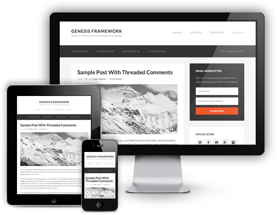
The important similarity between all six: they are all child themes for Genesis 2.0, meaning they are built on HTML5, mobile responsive, fast, and secure.
The differences will let you make the best possible choice for your audience.
So assuming you know who you’re designing for, let’s run down each of these six child themes that have been released this year. One of them will probably be right for you. (And if not, I guarantee one of these will be.)
Outreach Pro: the theme for churches
A church’s web presence is vitally important and can serve many key functions — from making sermons available online to generating awareness and support for worthy causes.
Outreach Pro gives churches the ability to reach out online and easily be reached right back.
Check out the Outreach Pro demo here.
Daily Dish Pro: the theme for food bloggers
The goal for any food blogger is to present content like it’s the most appetizing dish at a reader’s favorite four-star restaurant.
Daily Dish Pro is designed to do exactly that.
Check out the Daily Dish Pro demo here.
Education Pro: the theme for schools
Schools need to convey a lot of information online, and they need to do it with simplicity and flexibility.
Education Pro was designed with this in mind, and helps schools present everything from idyllic scenes to admission and curriculum information.
Check out the Education Pro demo here.
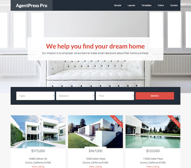
AgentPress Pro: the theme for real estate agents
Real estate agents can’t just put up a website and expect to build a business. They need to clearly display listings with eye-catching imagery in a mobile-responsive way that will impress visitors.
Visitors appreciate these details that help build the know, like, and trust factor — a vital component when the business transaction is as pivotal as buying or selling a house.
Check out the AgentPress Pro demo here.
Enterprise Pro: the theme for your brick-and-mortar business
Even offline businesses need to be online. (You know this.) And a business website built on Enterprise Pro is a bright, engaging online communication hub for customers and prospects alike.
In other words, it’s much more than just an online business card.
Check out the Enterprise Pro demo here.
Centric Pro: the theme for your online business (and more)
Last, but certainly not least, is Centric, which fulfills the single most important purpose of a website: it draws your reader in and leads him down the page.
All you have to do is define the purpose and provide the calls to action. Centric does the rest.
Check out the Centric Pro demo here.
Which one is for you?
So … which theme is the right fit for your audience?
Let us know by sending a tweet to @copyblogger (and don’t forget to include the #genesiswp hashtag).


This article's comments are closed.