Raise your hand if your website is designed for little Martian men. Go ahead. Don’t be shy.
Anyone? Anyone? I didn’t think so.
Our sites are created for human interaction. And we human beings — for all our splendiferous variety — share some universal behaviors, no matter where we’re from.
As publishers to the open web, we ignore these behaviors at our peril. What are they?
I thought you’d never ask.
Here are a handful of essentials for designing websites that humans want to read …
Humans want to interact, so make it easy.
Have you ever seen anyone navigate the Internet at gunpoint?
Me neither. For the most part, it’s a voluntary act. People click around because they’re looking for something. They want to interact with what they find.
And yet, website after website puts up barriers and makes interaction difficult. They use clever names, obscure taglines, and “funny” navigation terms that leave their site visitors scratching their heads, or worse — clicking away.
What can you do on your site to make it clear and easy to use?
Feature a straightforward introduction.
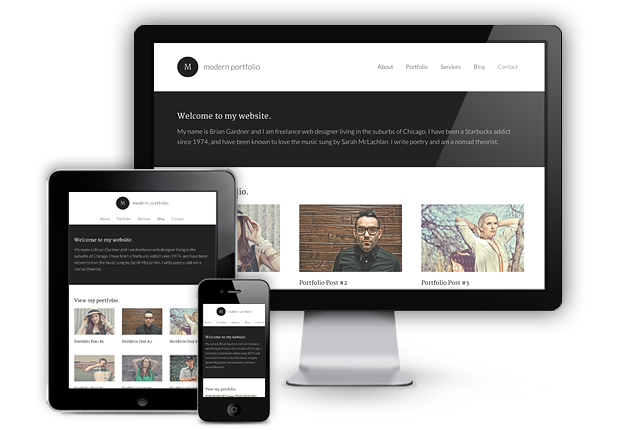
If your site is in English, your visitors will read it from top to bottom and left to right. When they arrive on your home page, their eyes will naturally go to the top left in search of confirmation that they’re in the right place.
At the top of your site, your readers should find your business name and your tagline. These essential words will let them know they’ve found what they were looking for.
Use obvious navigation terms.
If there’s a fire in the restaurant you go to tonight, will you look around for the egress? The portal? Or the exit?
When people click on the links in your navigation bar, it’s because they want to leave the page they’re on, and go someplace else. That means it’s not the place to trot out your creative tendencies and start calling your “About” page “Full Disclosure,” or “Dispatch from Headquarters.”
Just call it “About” and stop making your visitors work so hard.
That goes for all your navigation items. Label them in plain English using the most universally understood terms you can find to describe what users will get when they click.
Humans need to read. Don’t get in their way.
Websites are sculpted with pixels, and the most important pixels on the page are your words.
To get those words read, use these important design concepts to set them off and make them easy to absorb.
Embrace the white space.
If you expect readers to pore over line after line of your copy, give them a visual break. That’s what white space does.
Add white space to the left and right of your content area to give your words room to breathe. Don’t be afraid to space your lines out a bit — text on the web is easier to read when it’s not quite as compact as text on the printed page.
Show some mercy on our eyes.
There’s an evil design trend that’s popular right now. The older my eyes get, the less I like it. I call it the “tone on tone” style.
You’ve seen it before — it’s grey text on a light grey background, or brown text on a tan background. It’s colored type on a background that’s a slightly lighter version of the same color.
It’s low contrast, it’s not reader friendly, and it won’t help your cause.
Instead, use high contrast styles. Want the most readable text of all? Go for dark text on a light ground.
Here’s a site about contrast I found thanks to Copyblogger’s lead designer Rafal Tomal. It shows you why contrast is crucial. Spend two minutes reviewing it, and you’ll never go low contrast again.
Go with the scanning flow.
As readers scan through from top to bottom and left to right, you want them to see and read your information in a specific order. You don’t want their eyes jumping around the page, landing on lots of distracting graphics and text.
Position your content so that when they move through it, they’re absorbing your information in order. Put the most important item higher on the page, just below your header, and on the left.
Then use visual hierarchy to move them through your page at the pace and in the direction you want them to go.
They want to know who you are. Show them.
The first time your site visitors hit your home page, they’re full of questions.
What is this site? Who runs it? What do I understand about the values and personality of this business?
Because first impressions are visual, it’s important to answer these questions in the first few seconds with your site’s design.
Your tools of choice are colors and fonts.
Stick to two main site colors.
Look around on this page. Copyblogger’s two main colors are dark grey and blue. Green is used as an accent color, and stands out since it’s used sparingly.
That’s the effect you want to aim for.
Custom fonts add personality and make your site stand out from the crowd.
It’s easier than ever to bust out of the standard group of web fonts and experiment with fresh font combinations. For some inspiring (and free) custom font combinations, read this post by Brian Gardner.
Keep those eyeballs on your content.
Websites are made for the people that will visit them. There’s no greeter on your home page to welcome your visitors. That’s the job of your site’s design.
Work with human nature and not against it. Just keep asking yourself, “What would make it clearer?” and you won’t go wrong.
What will you do to welcome your website visitors and keep them engaged? Let’s share ideas in the comments.
Reader Comments (43)
The mistake that most of the bloggers make is that they don’t add images for themselves on their blog.
Thanks for this awesome post Pamela.
Certainly hate black pages with dim text…I sukppose it looks hip and young, but the readability makes it stupid!
Another point about contrast: font size. I feel a lot of blogs could benefit from larger, more readable type. Small text may be fine for younger users but anyone over 35 could be struggling to read your content. A few seconds of frustrations leads to lost customers.
Agreed on this one, Nick. Larger fonts are easier to read.
I’ve seen it go to the other extreme too: fonts used so large that body copy looks like it’s composed of subhead-sized fonts. Moderation is important. 😉
Hi Nick,
Good point- font size is matter! I hate small font.
Helpful insights, Pamela. I agree with you about plain-language terms, and not only in navigation . On LinkedIn, I often see writers describe themselves as wordsmiths. Hmmm . . . when people want to hire a writer, do they type “wordsmith” into the search bar? I think I’ll stick with “copywriter.” Not cute, but pretty handy – much like me 😉
Hi Jack,
Actually a wordsmith is a special term for someone who makes up words.
Usually they are hired for new products & stuff like that. Buck minster Fuller’s
“Dymaxion” car is one example of a wordsmith’s craft. The job is very different from writing copy.
But yeah, your point is well taken, probably the cases you mentioned the people were just using the term cluelessly.
Safest to use the word that leaves no one scratching their heads! Thanks for the comment, Jack.
Hi Pamela
I’m no web designer and this slows me down; I can only tweak my websites to the best of my ability. I do the best I can.
One change I need to make is to start utilizing AWeber. I’ve been using Feedburner on my writer website to send out blog updates, but I need to use AWeber. It’s on my To Do List.
As far as colors go, I agree that it’s important to select a color scheme that will be pleasing to the eye. However, if you’re an artist, designer, or even a writer with strong artistic abilities, I think it’s important to show off your creative side and personality. You don’t have to go crazy and wild, but you can add some personality to your web design.
These basic web design principles can’t be repeated often enough. There are still so many awful websites that violate one, if not all, of these you’ve listed here. Thank you, Pamela, for continuing your crusade to make the web readable. When I visit a website for the first time, the first things I notice are contrast (does it make me squint or back away), white space, and visual hierarchy (the web is no place to get clever when ultimately you have very little control over how it will display on your reader’s browser/device.) One thing I learned in 16 years of print publishing is that good design showcases great content, not the other way around.
“Good design showcases great content, not the other way around.”
Amen, sister!
hey Pamela,
good tips!
I always tell my clients (affiliate marketers and bloggers) to showcase their headshot on the sidebar and add a little bio… here’s a good example I’ve seen lately
http://www.aboutsymptomsblog.com
And no, it’s not one of my sites, or clients.
Hope it helps
Thank you, thank you, thank you. It doesn’t matter where I go I’m talking about contrasting vs complementary colors. I ask people, “Have you ever looked at the color wheel?” and I get blank stares. I was beginning to think I was too “old school”, but you have confirmed what I have been shouting.
Whether it’s the words to music projected on the screen at church or text in an article on a website, the text MUST contrast with the background or it’s hard to read. I was really beginning to feel a bit self conscious that I was just “getting old”. I guess I’m not old (O.K. so I am), but I’m practical.
When I write for wpmu.org I’ve had to learn how to write shorter and more broken up as well – leading people through an article. I’m from a technical background (and a sales background) so the tech side of me tries to tell all the geek speak and I have to make the sales side come out to “bottom line” it in the end.
Great article here. I don’t read everything top to bottom and sentence by sentence – I usually scan to see what catches my eyes. But, this one, I actually read from top to bottom and every sentence. Now, I’m off to check out the articles you linked to.
Thank you, James!
If I may add another one, I don’t like it when I’m greeted not with content, but with a pop up to subscribe to an email list. It’s fine to have a link on your page to it. I’m ok with that link being bold. But, please, don’t block the content I came to see with an ad I didn’t. I’ll only close the ad and click away. Far away.
Hello MaLinda,
This practice turns me off as well. I can’t stand when a pop-up ad invades my reading experience. I also despise flash intros haha.
Pamela, you provided us with an informative article that highlights the characteristics of effective web design. I agree with you in regards to not trying to be super complex with navigational terms.
I would rather click on “About” or “Bio” as opposed to “The Super Duper Trooper” haha. Thank you for this resource.
How many images are deemed appropriate for a blog post?
Patrick
Thanks, Pamela! These essentials of good site design are so intuitive, and yet we get caught up in “trendiness” thinking it will make up for poor design.
If we look at our sites through the eyes of our target market (I mean literally sit someone in your target market down in front of your website, and note their honest interactions and reactions ) it would revolutionize how we design our own sites.
Major league home run here Pamela. Bravo.
Great article, Pamela. It surprises me the number of websites I come across that seem to prioritize creative expression over basic usability.
Common sense advice to anyone wanting to develop a website. I love your straight-forward approach. Always think about your customers/visitors and what they want and need. If you think from their perspective, you can’t really get it wrong.
I think it is so important to include a smiling photo of the blog creator/author. It makes a big difference in how I feel about a blog. Thanks.
so it is time to restyle the comments section here. It is dark gray on light gray 😉 😛
Pamela,
I love the angle you have taken in this article, tapping into human universals. You ground your message on design and layout in science of the human evolutionary mind, those commonalities we share because we are all humans. This is significant because you are not referring to random or arbitrary aesthetic preferences, but you are suggesting that because of our nature we prefer certain visual elements. Your set up makes what follows even more powerful.
So flights of whim and individual preference are not going to fly for your if your desire is to keep readers on the page. On a subconscious, biological level, certain layouts and designs appeal to most readers and willfully or accidentally defying expectations will motivate them to leave your page that you have so meticulously design. Many overlook what you call “the most important pixels on the page.” We tend to focus so much on how nicely the graphics render and the colors mesh that we forget the black and white text, The graphics and color are mostly garnishes and desert to make the real meal more pleasurable – the reading.
White space and visual hierarchy are so important on the page, and failure to employ them efficiently defeats the purpose of the pretty graphics. Text that is bulky and hard to scan certainly does feel less appealing to read. I actually noticed this one day in two different English text books I examined, one with white space, visual hierarchy, and graphic design, and the other with huge blocks of black text, little white space. The pleasure of reading the well designed book pushed me to purchase it over the dry textbook, even though this one had better, more thorough content.
Well planned and executed, Pamela,
Darin
I think I follow your tips here. As a communication professional and a minimalist, I love the study of visual design and logical flow. My struggle is topic – my blog is somewhat eclectic, combining topics of writing, songwriting, forgiveness, therapy, blogging, God, and life. The blog supports my own books and music which also take a central role of the content. Do you think I need to have a more streamlined focus? Most of my readers hand to like what I do, but lately new readership is flat.
If a site’s text is not large enough or ads run too closely to content and I’m not sure what is what I’m a goner. I do not understand what the deal is with the gray text that so many web design firms are favoring. Even with my reading glasses on I have a hard time reading some of it. And don’t even talk to me about white text on black background. If your website is about a subject that black really suits do it somewhere else on your site. I guarantee you that you can get the effect you need without making it hard for us to read.
All good points. People get so caught up in being different and standing out, that it’s easy to do something silly that your end visitor may not understand. I do think that distinguishing yourself is important, but not at the expense of leaving potential customers behind. Good post!
I agree with you, especially your point in navigation. Websites should be user friendy, long gone thes websites back inthe 1990s with drak blue colours and flash elements.
Hi Pamela,
You’ve made some great points here.
So many websites and blogs make it next to impossible to read and comprehend the content. It’s aggravating.
I think a lot of it stems from people trying too hard to stand out from the crowd. Yes, that’s important, but there’s a better way to do it.
Having a horrible design makes a site stand out, alright, but not in the way the site owner wants.
In my opinion, the site design and layout is the very first impression to the owner’s credibility. It’s not the defining factory by any means. But if the layout looks unprofessional, most people won’t dig any further to see if it’s worthwhile to stay.
Thanks for sharing and I hope you have a truly outstanding week!
~Barry
An advocate of white space and writing in plan English! Why do some people still regularly break find those two simple rules? Good point about colour tone as well.
When putting together briefs for design projects, we always point clients to colourlovers.com, very useful site.
Nice one Pamela!!
Yes, it must be kept simple, as the book says “Do not make think!”
Great post, the scanning flow principal is especially insightful.
For me, before I start working on the pretty part of the website, I want to work on my website’s content. After all, people are going to want to visit my site for more than just pretty pictures! I made a list of the main sections that I assume others will want to visit. “About me”, “home”, and “links” are usually good pages to get started.
Being a colour-blind guy, you have no idea how much this helps me understand what people are looking for. The http://contrastrebellion.com/ site is pretty damn awesome too. Thanks for the article – I am saving this one. It’s a keeper.
What about all the multiple blurring and popping links? Honestly, when I go on my Facebook page, I really feel challenged by the amount of recommendations, apps and people I might know – I always click on something wrong accidentally, get carried away to some strange location and hit “close” at the end. What do you think about it? Probably, this website “feature” could have been included in your list.
The best websites are those that are very easy to navigate with very few click of the button. It is even better when each click of the button gives the visitor concise and helpful information about the website or what he visitor is looking for
“What would make it clearer?” : I see so many beautiful web designs that are so confusing it makes them worthless. A nice looking website must also accomplish its purpose, without a purpose it has no worth. Well said!
This article's comments are closed.