This is another addition to our ongoing series of tutorials and case studies on landing pages that work.
Daniel Heuman’s software helps writers, editors, translators, and proofreaders prepare error-free documents with greater ease and speed. He tried and abandoned PPC (pay-per-click) advertising, as he discovered the folks who clicked through weren’t his best prospects. (That’s a technique that almost certainly deserves some more thought and attention another time.)
Daniel is now marketing directly to prospects via email and showing some success, but he feels more can be done.
Let’s see what we can do.
- The Goal: Generate enough free-trial downloads to sell 3 licenses a day.
- The Problem: If folks are downloading a free-trial and not converting, it’s a product vs. value problem. If the problem is growing the numbers of prospects to take the free trial, that’s a traffic problem. If interested prospects are visiting the site or landing page and not engaging with the message, that’s a conversion problem.
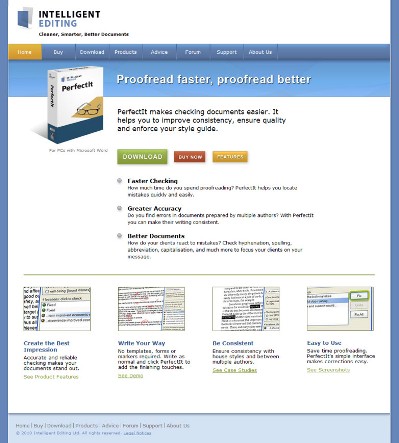
- The Current Landing Page (homepage): http://intelligentediting.com
- Value: $90.00
The Maven’s 10-Point Critique
My personal take is that Daniel needs to generate enough traffic – via organic, SEM and social media channels – to grow his own mailing list to which he can continue marketing to his heart’s content. A stronger, more effective homepage would offer an overall boost to his ongoing marketing efforts.
#1– Make your case in the first screen with a strong, provocative headline.
Why would a professional writer or editor pay $90 for additional proofreading functionality?
The rational reason: Cleaner, error-free documents.
The emotional reason: To look better in the eyes of a boss/client/customers.
Sloppy work reflects badly on the writer and the company represented. Clean work makes everyone feel good and confident.
So while the current headline: “Proofread Faster, Proofread Better” is a clear statement, I’m wondering how we can juice it up a little? How about:
Just One Typo Can Rob You of Credibility and Cash
You’ve just gone from “reasonable” to “irresistible” with a provocative headline that resonates emotionally with the visitor.
#2 — Add more oomph to the tagline.
Again, your tag is very clear on the most basic of benefits: Cleaner, Smarter, Better Documents
That’s a good start, but then I’m thinking … why and for what?
A great exercise for headlines and taglines is to take your basic feature or surface benefit and “Why? Because!”or “So what?” your way through it until the core emotional truth is revealed.
Try working these words (or their variants) into your tagline:
- polished
- presentation
- reflection
#3 — Invite your visitors to take your video tour from the get-go.
You already have a nice little video, yet you’ve basically hidden it from view. Slap it on your homepage and do a voice-over track. I found watching the material without a guiding voice unnerving.
Your voice-over would allow you to expand on the action in the video and highlight those areas of greater interest.
Don’t hide the good stuff. Warm it up and share it.
#4 — Be upfront about who this product is and isn’t for.
The only place I see “MS Word for Windows” is in teeny type under your box illustration. I’d give this more push so Mac users can grunt and grumble under their collective breath and move quickly elsewhere.
#5 — Keep sprinkling the goodies that keep visitors thinking “This is for me!”
Highlight the product’s ability to proof both British and American English. This capability strikes me as huge benefit for writers/editors working internationally.
You also have a strong guarantee. Get it on a homepage badge and show it off.
And you make customized versions — another wow, especially for those working in big organizations.
#6 — Rework your navigation for greater clarity.
You’ve hidden a lot of the product goodies in secondary position in terms of your primary navigation. I suggest the following revisions:
Primary navigation
- HOME
- Features
- Success Stories (Testimonials & Case Studies)
- Reviews
- Resources
- Download & Pricing
- Contact Us
Secondary navigation:
- About Us — FAQ & Tutorials — Forum — Blog — Support
#7 — Build your traffic organically with smarter SEO.
This is your current title tag for search:
<title>Intelligent Editing — Cleaner, Smarter, Better Documents</title>
A tagline, though, isn’t necessarily a good meta title — and it’s the title tag plus the content that Google sizes up and determines your topic and site relevancy.
So let’s adjust and get some primary keyword phrases in the front of the title like this:
<title>Proofreading & Editing Software for MS Word Documents :: Intelligent Editing</title>
I didn’t do the research to determine if these are indeed the best keyword phrases, but you get the idea. Frontload the terms that your prospects are using to find you … and add the product name, too.
#8 — Build your mailing list with a newsletter and a blog.
Since your email campaigns have been pretty effective for you, that means you need to add more names to your list so you can continue doing — and expanding on–– what works for you.
Add a newsletter sign-up and offer one or more of your current resources as a bonus for subscribing. Add a blog, too. It doesn’t have to be fancy or involved. See tumblr.com or preposterous.com for some easy-to- implement ideas.
#9 – Connect with your prospects with social media.
Build your authority in this niche space on this niche topic via Twitter, Facebook and LinkedIn. If there are writer/editor specific social media venues, make sure you have a presence there, too.
Social media is a long-term strategy to building credibility and a fan base that trusts you and ultimately your products for purchase
#10 — Tweak your homepage with one big Call to Action.
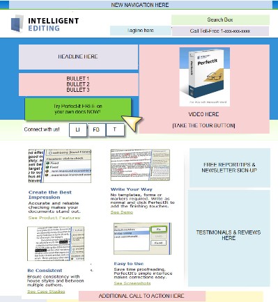
I’ve tweaked your current homepage to reflect and illustrate the suggestions I’ve made here. (I know you didn’t want me to, but honest, I just couldn’t help myself. :)) You could easily flip the placement of the video and headline/bullet/call-to-action sections.
(Mea culpa for the incomplete sentences, dangling participles, and other little idiosyncrasies that make editors weep and gnash their teeth. All I can say in my own defense is this: “I’m a copywriter.”)
My thanks to Daniel Heuman for his patience and support of Heifer International. Look for my next makeover in approximately 4 weeks.


Reader Comments (46)
Excellent makeover!
I learned a lot of things from your review of his landing page!
I really liked how you said:
“Make your case in the first screen with a strong, provocative headline.”
“Just One Typo Can Rob You of Credibility and Cash”
So here is the perfect example of a copy that ’emotionally connects’ with the visitor! And this is exactly what we should aim for.
Kindest,
Nabeel
Hey Roberta,
It’s amazing how much I can learn by you dissecting this landing page. It’s the little things that make a huge difference. So many times we are working on something and we over look the simplest thing in our work not realizing that it can make a huge impact.
Chat with you later…
Josh
Wow, what a great makeover. I learned so much from your tips. I am going to keep asking “Why?” and “So what?” until I find the gems.
Love the headline you came up with!
Hey Roberta,
Excellent post, I am starting to venture into product creation myself, and I have decided to use social media portals to test whether their is a growing need in a niche I am planning on pursuing. My question is, how long do you think someone should use Social Media to figure out what their customers needs are? Or do you think it’s all arbitrary?
In the words of the immortal Yogi Berra: “When you come to a fork in the road…take it!”
I guess that’s where I was with one of my problem sites. I just couldn’t figure out which way to go. I was struggling with some decisions. Your post helped me put some pieces of the puzzle in place.
Thanks!
Steve Benedict
Sometimes you get a pretty good headline written when you have a tight deadline looming.
@Asim – I think you need enough time to not only research your marketing, but have time enough to test behaviors. So I’m thinking 3-6 months to get the job done right if you’re coming in cold. If you already have deep knowledge of your market, you can do it in less time. The direct marketer in me, however, only trusts what people do and not what they say.
Such a good point! People will say all kinds of crazy things. (That’s why surveys aren’t as valuable as actually testing a prototype or beta version of a product — there’s a huge difference between people saying they’ll buy and people actually buying.)
Added benefit to the makeover: Just discovered a cool Software
Do people really watch videos of products? I always prefer screenshots, but that’s maybe just me.
Roberta & Sonia,
Thanks for the advice. I believe it was Jay Abrahams who said “Everything is a Test”, so I understand the value of testing out the market before creating a product. 3-6 months testing is actually new to me, but it makes perfect sense, I guess you want to really drill down on what your market’s needs and wants are so you know the product would turn out to be profitable.
I following all the series of this makeover clinic and applying all the info to my http://www.fonts4teachers.com site and i am experiencing more conversions and visitors everyday.
Congratulations Roberta!!!!
@Asim – it’s more than just testing of your own product. It’s also about observing, researching market behaviors regarding competitive product.
@Dana – More conversions, more visitors everyday. You’ve made my day, Dana!
I love the concept of non-cutesy, dead-simple, plain-as-possible-English navigation. I see so many site owners have misleading nav items that waste precious seconds of the users’ time, and keep users away from the main objective of the site.
That said, this particular landing page was pretty decent, so it’s cool to see that you were still able to improve upon it, Roberta. I’ve definitely seen some landing pages in this series in much more dire need of assistance!
@Doron – it’s the already pretty good ones that really make me think “what is this missing, what more does it need (or what less does it require.) Clarity over clever, always.
Honestly, they have to target the freelancer market. Oh, wait, they already have, by appearing on copyblogger. But we outsourcing pros need more than a few lines of text to get excited. They wouldn’t have to hard-sell to people who write/edit for a living. Just a bit more persuasive power will do.
Someone who owns WS, another editing software with the same price tag, would appreciate it if they gave more info on the free trial, a way to get updates (just in case there’s a 50% sale in the future) and maybe some hints that it’s better than WS.
R.
Roberta,
As a result of the series, we are making a lot of changes to the web, in fact, we are going to revamp it with all your advise and input. The one we have now, although improving conversion and visitors, still is not very professional.
Keep testing and tweaking. It will come.
Wow! Exquisite talent you have in “drilling down” to pull out the diamonds. Amazing makeover which I thoroughly enjoyed reading. Thank you for sharing your insights. Just brilliant!!!
@Roberta, thanks again for this. We obviously had some advanced sight of this text and we’ve already made changes based on it (new headline, joined and linked to Twitter, changed the navigation, added proper tags, made the video more visible). I also found a voiceover artist for the video, but am still working on the script. And I’m definitely going to use “Just One Typo Can Rob You of Credibility and Cash” I just need to think about where to deploy it.
@Remy, the split between screenshots and videos is one of those strange things. Everyone has a preference and no one believes that people could possibly prefer the other. I definitely recommend providing both.
@Ruby, thanks for the suggestions. I don’t think the homepage is necessarily the right place, but I’ll give some thought to making those elements clearer.
Excellent makeover, Roberta!
All your makeovers are all simply wonderful–and offer so much useful information. Thanks so much.
Roberta: Excellent as usual.
Daniel: I believe you’d sell more product simply by having audio on your demo video.
Hi Roberta – Thank you. I love these tutorials. It’s far easier to follow when you’re using real life examples.
When I saw the software and the price, I must admit, I wasn’t tempted by it at all. But your changes really drew attention to the benefits – especially the part about one typo ruining your credibility.
I am curious what designers or writers are charging to design or redesign landing pages like this?
ps. Daniel: If I can spot a proofing error on your site, can I get a free copy of your software?
I *love* these makeover posts. Lots of great ideas. I’m getting ready to makeover several client sites… (eventually I’ll get to my own, it’s very sad, really)
I love a good headline!
Wow Roberta – this stuff is pure gold! I’ve tried the adwords->landing page model in the past and failed. You’ve just pointed out all the reasons why that happened!
Thanks for sharing!
I always look forward to these makeovers.
+1 for a single big call-to-action. Too much choice right now.
Here’s one to fix: about page has “unparalled”
@John and @Shane, An instance of Muphry’s Law? http://bit.ly/KiHqv
G’Day Roberta,
I think that your makeovers are one of the most valuable services provided by Copyblogger. I always , as i like to call it, “enjoy and learn.”
And thanks to Brian and Sonia for providing the space.
Make sure you have fun.
Regards
Leon
Hi Roberta!
I’ve just found your blog and really like the makeovers that you do. I find it’s always best to learn by ‘doing’, but with you doing it for us – it makes it even easier for me to learn!
Rachel
It’s funny how a lot of sites will tell you that organic seo is dead, but it’s really alive and well. In less than three weeks I’ve made it to the top of quite a few google pages with more than 60 million results.
@Valerie – our own sites/pages are always the shoeless cobbler’s children.
And now having seen it months after writing it, the headline should read:
Just One Typo Can Rob You of Cash and Credibility
Better flow and rhythm.
@Jason – organic search is as important as ever, it’s just not the only chocolate in the marketing box.
This is probably the single most useful blog posting I’ve ever read. I’ve struggled to get my own site for local businesses off the ground and it’s almost painful at times where to put stuff (buttons, videos etc.) and how to say things…
Thanks! now i’m going to go read this again!
b.
Roberta, Terrific stuff! (each and every time). I’d like to suggest the client put a benefit in his Title tag. You see, our SEO Title tags are our first opportunity to make a sale. They show up in at least 3 important places: 1) On the SERP (Seach engine results page) Hello! 2) Homepage title bar (upper left corner) and 3) Browser bookmarker Wrapping key phrases in benefits is the charge of the SEO copywriter – get found, get bought is how I like to roll. Try wrapping key words and key phrases in benefits all over the place – body copy, etc.
Peace and profits, Tia D.
Excellent SEO copy advice, Tia – thank you!
Excellent, great advice, loving this series.
I really enjoy these makeover posts. Yes, yes, yes to #4! It’s so common to see businesses hiding or not highlighting what they can’t or don’t do. Perhaps avoiding what may seem like a negative. But really, in doing so you are just asking for major user frustration and creating a much bigger negative in the end. Gotta be up front with those limitations, and there are many cases when you can actually put a positive spin on them.
@Martina – if you’re not for everyone, it’s a good thing to say it upfront and then reinforce the goodness for the folks who fit the profile.
I always enjoy your analysis. It makes me stop and think about my own pages.
love the make-over and the written changes are amazing, makes such a psychological difference when reading the two. “Love the drilling down to find the gems” approach, gives me more to think about with my own pages
thank you!
If you’re finding success using these tips in your own sites and landing pages, please let me know!
This article's comments are closed.