This is another addition to our ongoing series of tutorials and case studies on landing pages that work.
Most days I just don’t know what’s safe to eat or drink, but I’ve always thought that soy was a better, more nutritious choice for my protein needs — didn’t you? More vegan and all that.
Well, that’s not the way Dianne Gregg sees it. In fact, she thinks the stuff is downright dangerous to your health and well-being. Ever wonder how much soy is actually lurking in the food we eat, unannounced and unidentified? Dianne has the goods on that info, too, and she wants to share.
She’s got a blog, a newsletter, and a book. She wants more subscribers and she wants to sell more books. For the purposes of this makeover, we want to focus on growing her subscriber base. Grow the subscribers and the book sales will follow.
- The Goal: Increase subscription rate to 100 new subscribers weekly toward the overall goal of converting subscribers into buyers for her book, The Hidden Dangers of Soy.
- The Problem: Need more traffic, unable to directly track sales from promotional efforts, including social networking, article writing, blogs, etc.
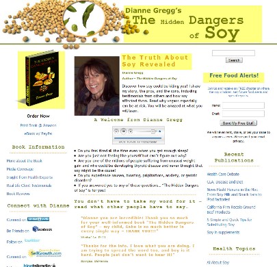
- The Current Landing Page (homepage): hiddensoy.com
- Value: $17.95 (a little cheaper at Amazon) & $10.50 e-book
The Maven’s 10-Point Critique
#1 — Focus your readers’ attention with a strong establishing headline.
Your content doesn’t offer a clear entry point (I’ve highlighted the different areas where you dance all around it) where you connect the dots for the visitor. You need a strong headline to tie it all together, like:
“Could All the So-Called “Healthy” Soy You’ve Been Eating Actually Be Making You and Your Family Sick?”
(A variant for moms could be: “Could All the So-Called “Healthy” Soy You’ve Been Giving Your Family Actually Be Making Them (and You!) Sick?”)
It’s not enough to just present the danger; you need to make it personal.
#2 — Focus your content on the single most important thing you want visitors to do.
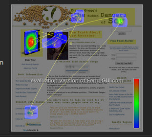
Here’s a heat map I did for your current site. (Courtesy of Feng-Gui.com.)

Notice how your newsletter sign-up area doesn’t light-up at all. The main focus is on your book cover and your headshot.
If the goal is to increase newsletter sign-ups, then all content — directly and indirectly — needs to support the visitor from first view to action. Your current content is a disorganized hodge-podge with no clear path from A to B. You need to put your book and its ancillaries in a secondary position and push your newsletter forward.
Also, does your newsletter have an actual title? I couldn’t tell from your current content. If not, give it one. Add “Dianne Gregg’s” in front of the name, just like you did the website.
#3 — Focus your content on building your authority and credibility for the topic.
Since you’re focusing on you and your expertise, you want to give your visitors enough info on your experience, background, quality of information you present, etc.
Starting with your personal story is fine, but you want to bring in scientific and medical experts as well as fans to support your expertise in this space. You do this in your book section, but there’s no reason why these kudos wouldn’t apply as general testimonials, as well. Use them that way.
Get them on the homepage where they’ll do you some good, as well as a separate section on the navigation. (Please note that a poorly written testimonial from a medical professional undercuts its value to you. All testimonials — from experts and just folks — should be written in clean and properly spelled standard English.)
I like the audio player. I might consider doing a video intro, as well.
#4 — Provide intuitive paths for your visitor to move around the site.
If you’re going to use your homepage as your main landing page, you need to have a navigation strategy that organizes your content for your visitor in a common-sense way.
Right now, you have ZIPPO navigation which makes moving through the site a tedious, frustrating exercise, even for the most committed soy-information seeker.
Here’s a recommended first pass:
- HOME
- PUBLICATIONS
- Newsletter
- Book
- TESTIMONIALS
- ARTICLES
- RESOURCES
- BLOG
- ABOUT DIANNE
- CONTACT
You have a lot of content on the site that could easily be thrown into these or equivalent buckets. Don’t make your visitors hunt for what they need.
#5 — Rethink and reorganize your homepage/website from the ground up.
Detecting a theme here? Sites that do a great job of organizing their content through intuitive navigation and clean, supportive design make for a comfortable and pleasant visitor experience. The easier and more pleasant the visit is, the longer the visitor stays on your site and engages with your message.
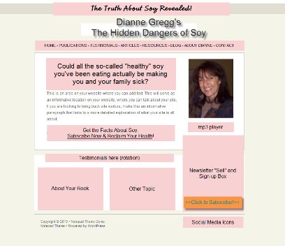
I found this simple WordPress blog template (courtesy of Notepad Theme Demo at IThemes) that provided a reasonably good format as a jumping off point for a possible redesign.
What works well here is that it allows you to highlight several different inputs for visitors to interact with, yet still focuses the primary attention on newsletter sign-up and you.
#6 — Rework the current banner.
Most people, including myself, wouldn’t know a soybean from a chick pea. I don’t think the image of the soybeans underscores the ‘dangerous food’ motif. I’d substitute a new banner that’s clean, clear and forceful about your topic.
#7 — Clarify your calls to action.
Right now, your call to action focuses on “Send me free stuff.” There’s no connection to the benefits of your topic (I want to stay healthy) or even that I’m getting a monthly newsletter (Subscribe or Join us now).
Again, connect the dots for your visitor. Remind me of the value of what you offer and how great it is that I’m going to get this important health information every month — free.
#8 — Clarify the newsletter specifics.
I read your newsletter page several times and wasn’t sure how the newsletter was formatted or what information/regular features came with it.
If this was a print publication, you’d talk in terms of number of pages, size, a number of main articles and a few regular features. So using this as a model, how can you translate this kind of detail to a description of your digital newsletter?
Give your prospects specifics. Design a cover visual and pop a thumbnail into the newsletter box on the homepage. Make it real.
#9 — Clarify the bonuses new subscribers get.
You offer a ton of free information for a sign-up (as noted on one of your interior pages), but I’m not sure what format they’re in. Are they individual reports? Articles? Separate emails? Again, be specific. Don’t just list a title and call it done. Add 1-2 sentences of description and detail. Add a value to each bonus offering, as well.
Tally them up, restate the value of good health in the face of lies, and make a strong call to action that makes the prospect ‘gotta have it’ — and wrap it all with a big fat call to action button.
#10 – Strengthen your SEO title and description (critical).
I did a quick search for “soy risks” on Google and you were nowhere to be found. That’s because your pages are missing those super important SEO title and meta descriptions.
Here are your current listings:
<title>The Hidden Dangers of Soy; Dianne Gregg</title>
<meta name=”description” content=”NONE”>
Here’s another way of going about it:
<title>Health Dangers of Soy, Are You At Risk? Get Free Newsletter | Dianne Gregg</title>
<meta name=”description” content=”The Hidden Dangers of Soy, by Dianne Gregg, reveals the dangerous truth about soy, its health risks, and why you should avoid it. Free newsletter and information.”>
Do your keyword research. What are the words and phrases people use to find your info? Those are the words and phrases that will form your site glossary for content as well as SEO and make it easier for people to find you.
My thanks to Dianne Gregg for her supreme patience and support of Heifer International. Look for my next makeover in about 4 weeks.
Want your own Copywriting Maven landing page makeover?
Got a landing page that’s more poop than pop? Need to get better results from your online marketing?
If you’re interested in a private page makeover, site audit, or other services, please email Roberta directly.


Reader Comments (29)
You’ve done it once again Roberta…
I totally agree with you that fear-based headlines really command people’s attention and make them keep reading.
I would include a really awful picture of someone with a diease from soy, or a pic of something that soy does to your organs… a before and after shot can be worth millions. Just look at the diet industry.
I would suggest making this at least a two-step sales process instead of just trying to sell the book right off the bat. It will give her more long-term customers.
Use the home page as a blog instead, showing new articles about the dangeers of soy, gathering an email list, and plugging the book on a frequent basis through marketing. This way, when the person clicks away from the page, you can bring them back by reminding them of your great information.
The way it looks now, you only get one try to close the sale, which can kill a business. She is going to need a lot of serious incentive to get 100 new people a week to sign up for such a niche product.
-Joshua Black
The Underdog Millionaire
Hey Roberta,
This is awesome! I like how you break down the blog and build it up so we can learn from it. I learn couple of things from this case study. That heat map is a very powerful tool. Going to check it out.
Chat with you later…
Josh
Nicely done as always, Roberta.
I think I’d also consider color scheme. The current feel doesn’t come close to danger for me. Perhaps some reds are in order.
Great advice Roberta.
“Notice how your newsletter sign-up area doesn’t light-up at all. The main focus is on your book cover and your headshot”
“You need to put your book and its ancillaries in a secondary position and push your newsletter forward”
This is very important. You should have one call to action. If you have too many, the visitor will get confused and is unlikely to take any action. Make that one call to action the most prominent. If you give them too many choices (even 2 are too many), then you are not doing a good job.
“Also, does your newsletter have an actual title? I couldn’t tell from your current content. If not, give it one. Add “Dianne Gregg’s” in front of the name, just like you did the website.” This is very important too. It helps in branding purposes and the visitor can actually relate to it.
“Again, be specific. Don’t just list a title and call it done. Add 1-2 sentences of description and detail. Add a value to each bonus offering, as well.” Yup, never assume your visitor will know something. Always clear it out to them and show them exactly what they will get.
And I agree that instead of the soy pictures, there should be something else, as it is an anti-soy website.
Nabeel
Wow,I do love this post. I’m trying to apply the info in each post.
very much pretty and interesting….
I liked it….Thanks for sharing…
This is a really informative and helpful article for us. We purchased the Thesis WordPress Theme and look forward to learning and using it for our website and landing pages and this will avert the beginner mistakes.
Especially appreciate the Heat Map link – Thanks!
I’ve never seen that heat map before. That’s a great tool. Thanks for the article!
These are such a good resource, I’m so glad Roberta shares them with us. I always learn something new each time she does a makeover.
I’m so glad someone actually reads them.
I love these landing page makeover posts, they are so helpful. This struck a chord with me:
If this was a print publication, you’d talk in terms of number of pages, size, a number of main articles and a few regular features. So using this as a model, how can you translate this kind of detail to a description of your digital newsletter?
It seems so obvious that there should be a formula or set template for a newsletter, but it never occurred to me.
This post also makes me want to use heat maps.
Heatmaps are a wonderful evaluation tool in the conversion arsenal. Used in conjunction with other metrics, heatmaps can uncover trouble spots in a visual, compelling fashion.
Roberta,
This little article should help grow your legion of fans.
It’s “show and tell” …and I think that’s critical to the learning process. Too often, we receive good written instruction without the visual element that helps translate the post into something that “turns on the light”.
Loved the heat map. I guess I’m just a visual guy! I know I learn more from you than many other teachers. Thanks for sharing so freely.
ps: @Nabeel. I always appreciate your contributions, too.
Steve Benedict
Roberta,
Just went to MPG Direct. Is that your site? It’s very simple, and I didn’t get a feel for a gripping headline that held my attention. In fact, there was no headline, unless you count “Specializing in our passion for information”, which was so small ,next to the cup of pencils, that I almost missed it. There didn’t seem to be any call to action. In fact, there were almost none of the elements that you describe above. I was disappointed.
Please tell me I clicked on the wrong link.
As always, great info. Will analyze my landing page today!
@Jon … a corporate website hompage has a different job to do than a landing page geared to selling, but to your point. My MGP site, like the proverbial shoeless children of the cobbler’s tale, gets short shrift since I spend the bulk of my time ‘making shoes’ for clients.
In a hair salon, I always look for the stylist with the ‘worst’ hair. Means she’s busy with her/her customers and no one else in the shop is as good.
When I get a spare moment, MGP is on my list of biz/personal sites to update.
Great information. I will use your analysis method to analyze my website.
What about the fonts? I believe I see a mixture of at least two or possibly three fonts, and except for being sans serif, they aren’t complementary in style…the use of Courier seems more disconcerting than “eye catching”.
I would also suggest changing font colors. The pastel green and orange text contributes to the busy look and simultaneously fades into the background losing their information value. Try sticking to two colors using variations of point size and boldness to distinguish sections…maybe a third color in one area for the call to action.
The center col. of text needs larger borders, they run into the left and right cols, especially in the middle.
IMHO
A few more things – I read just one blog post and it had some typos – proofreading is so important, especially when you are sharing information that goes contrary to what many people believe. You need all the credibility you can.
Also, someone left a nice comment on this post a month ago:
http://hiddensoy.com/is-soy-bad/
You never replied. You don’t get that many comments, but surely you can give a simple answer/reply each time you do. Before you say you’re too busy to reply to blog comments, let me mention that I’m a homeschooling mom with an online business and I reply to every comment at my blog. I make the time.
To succeed online you have to be thorough – it’s all about the details. In my mind, if you improve your landing page but you don’t build on relationships that come because of your articles, you’ve failed.
Roberta, thanks. I know mine is too crappy to expose… I need to get on that.
Great analysis, but it doesn’t look like she absorbed the wisdom you so generously dispensed. There’s all kinds of crazy font colors and sizes, and the page looks unprofessional and disorganized. I was interested in the subject from this post, and then I went there, felt turned off and left.
@Kat – While I do the analysis for one participant – who for their own reasons can accept/reject all/part of my recommendations – everyone here gets to look over my shoulder and learn something they can use for their own sites and blogs.
@Lola – I’m guilty of the occasional typo and dropped word so I try to be generous with others. But responding to comments is an easy way to build trust and a loyal readership.
Great site makeover, It really flows so much better now. Just a few simple changes go along way. Would love to have my site looked at for possible makeover.
Thanks for sharing your expertise with us.
What I find amazing is how similar this process is to much of what we do with our own website redesign clients. We don’t handle copywriting, but the rest is way similar.
Just goes to show you how much different disciplines bleed into each other when it comes to making websites better.
@Naomi – like a movie, several disciplines are employed to make a grand show.
Roberta,
Really , really good advice, i have emailed you to see if y uo could review our site. I think your comments are very good and i am trying to include the best bits,
To change meta tags or keyword descriptions easily, you can use two WordPress plugins. One called All In One SEO Pack and the other is Platinum SEO.
These two plugin make it simple.
@Anthony – Or you could just use Thesis so you don’t need to keep updating another plugin every two seconds. Copyblogger uses Thesis so you know it is the business!
This article's comments are closed.