What are some winning call to action examples? Creating a strong call to action (CTA) is essential to turn visitors into leads, but how do you come up with the perfect one?
If you’re struggling to create a strong CTA, this framework will help you craft a unique CTA optimized for your business.
What is a call to action?
When you start studying how to be a copywriter, you learn that a call to action is where you tell visitors about the action they should take next after viewing your content (landing page, pop up, blog post, social ad, etc.).
If you think of the roadmap on your customer’s journey, the CTA points the visitor to the first step in the buyer’s journey.
What’s an example of a great call to action?
So, what is the best type of call to action?
Unfortunately, there isn’t a one-size-fits-all solution or a single perfect formula for all businesses.
Different companies will use different copywriting strategies depending mostly on the buying cycle and their ideal customer’s pain points.
For example, someone selling CRM software will likely have a very different CTA than someone selling you a $10 meal.
The CRM company’s CTA would probably be a soft ask first, such as a quiz, watching a demo video, or viewing a case study. However, a meal service might have a more direct CTA, such as “Order now” or “Buy now.”
Nonetheless, you can certainly do a few things to improve conversions regardless of your business industry and model. Here are a few tips.
Create a strong setup
The CTA extends well beyond a buy button.
The copy around the CTA will have a much more significant impact on the CTA’s success than the trigger words on the button itself.
The key to nailing the setup is to know what resonates with your audience.
For example, if you’re selling CRM software, you might want to include data from a case study and hit on a key pain point.
An example might look something like, “Drive more sales in less time. The solution to 10x lead quality.”
Use action words
Your storyselling goal is always to have the visitor take action, so it’s no surprise that you should use verbs in your copy.
For example, some of the most common CTA words include:
- Unlock
- Join
- Start
- Begin
Provide instant gratification
Many fantastic CTAs also provide gratification.
For example, if you sell heatmap software, rather than featuring a button that says “Go,” the button might say something like “Show me my Heatmap.”
You can also use instant gratification in the setup copy. As you’ll see below, OptinMonster has setup copy that says “Instantly grow your email list, get more leads, and increase sales.”
Notice that nailing instant gratification also requires professional writers to have a deep understanding of their audience and their pain points.
Create urgency
Urgency is also key, particularly for low-ticket products. For example, including words like “now” and “today” can help increase conversions.
When appropriate, you can also add countdown timers and inventory counters.
However, if you claim you will close an offer, you must shut it down. If not, your customers will learn that there really isn’t any urgency and might question your marketing ethics.
Make it irresistible
When an ideal prospect lands on your website, it’s your job to present them with an offer that is so relevant, it’s a no-brainer to accept.
You’ll see that a lot in the upcoming call to action examples.
Creating a truly irresistible offer also requires you to understand your audience’s pain points.
For example, if you’re a meal delivery service, a serious lead really wants a meal delivered to their house right at that moment when they land on your website. Therefore, if your CTA offers a free first meal, it’s a no-brainer for them to accept.
Similarly, if you sell mattresses and offer $200 off a customer’s first purchase, a serious lead who really wants a mattress will happily give you an email address for $200.
Want us to
scale your traffic?
For the first time, The Copyblogger methodology is now available to a select few clients. We know it works. We’ve been doing it since 2006.
20 examples of calls to action that convert
Ready to review CTAs that convert?
While your exact copy will depend entirely on your audience and style of business blogging, here are 20 stellar call to action examples to inspire you.
From B2B to B2C, there’s a mix of everything on this list.
Homepages and landing pages
I Will Teach You To Be Rich
Ramit Sethi is known for outstanding copywriting, so it’s no surprise that the CTA on his website is also exceptional.
He offers a wide variety of courses through his website, so rather than sending the audience to a generic page, he has them take an interactive quiz and then sends them to content that’s the best match for them.

Despite the fact that his audience has different interests, they do all have one thing in common: They want to make more money and do so quickly.
He perfectly harnesses that pain point by asking a reflective question and offers to provide a quick solution — in as little as an hour.
Given that his courses are usually several thousand dollars, his buying cycle is much longer, so he makes a soft ask with just the quiz.
Notice that the CTA also uses an action word (start), and the setup copy digs into the ideal persona of his buyer.
Crazy Egg
Crazy Egg offers heatmap software for websites.
This CTA also digs into the buyer persona. You can tell just from the copy that it targets a data-driven B2B marketer who wants to improve their website right away.
In addition, they add proof and credibility by writing “300,000 websites use Crazy Egg.”
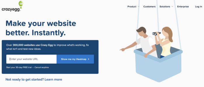
The language “Show me my Heatmap” also offers instant gratification and tells the visitor exactly what they will get by entering their website URL.
By adding a 30-day free trial guarantee, this one of our call to action examples seals the deal for a qualified lead.
SparkToro
SparkToro has a fantastic CTA that is clear and concise.
Given that this is still a relatively new company, the setup for the CTA clearly states what the tool does (shows the websites your customers visit, etc.) and how it can help you (so you can do marketing that works).

They have a freemium model, so the first step in the buyer journey is to get prospects to try out the software and understand how it works — the CTA is to use the tool.
If you’re an ideal lead for this product, it’s a no-brainer to use this free tool to solve your problem.
OptinMonster
OptinMonster offers conversion optimization software, so it’s no surprise that they have a killer CTA.
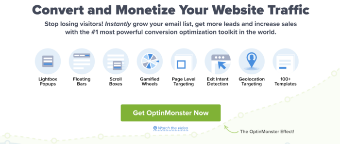
The OptinMonster CTA is one of the only CTAs on the list that has both persuasive writing and a persuasive visual.
The image captures the audience’s attention, and anyone who wants to grow their business will be compelled to read the rest of the CTA.
The clear copy appeals to B2B customers since it promises to:
- Grow your email list
- Get more leads
- Increase sales
Finally, the copy offers instant gratification by starting with the word “Instantly.”
Lyft
The Lyft CTA is an excellent example of a CTA for a B2C product/service with a short sale cycle.
While this CTA isn’t selling a product or service, the value is still simple and clear: You can earn money by driving.
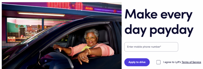
Given the simplicity of the offer and the short buying cycle, they don’t need more guarantees or data.
Helix Sleep
This CTA is irresistible to a qualified lead.
If you’re mattress shopping and come across this site, you’re bound to click on it even if you aren’t yet sure if you want to buy from them.

As they sell relatively expensive luxury mattresses, the visitor might freely enter their email address in exchange for a discount and free offer.
Salesforce
Salesforce is one of the only companies that intertwines a case study with their CTA.
It’s brilliant because rather than saying why their product is wonderful, they show how generates success for their customers.

Approaching the prospect from a data-driven standpoint (drive a 62% increase in customers) also adds credibility to their brand.
It will also increase appeal to their ideal prospects (people who want a CRM to help them generate more leads faster).
In addition, both of their CTA buttons are non-committal. This works well because it increases their chances of getting a “yes” from each visitor.
MyFitnessPal
This product is designed for people who want to improve their health, lose weight, and get fit.
However, many of their customers are beginners. As a beginner in fitness, one of the biggest pain points is the overwhelming abundance of information available. Therefore, their product exists to streamline getting started.
In this one of our call to action examples, the CTA reflects their ideal customer profile. It mentions, “Good health starts,” which welcomes their beginner audience and establishes the brand as a solution to simplify fitness.
The first sentence also taps into the lead’s pain point, as strong leads for this product often feel their diet is out of control.
Finally, they break down three simple things the app can do:
- Track meals
- Learn about your habits
- Reach your goals
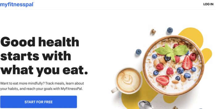
The copy on the button is also non-committal since it emphasizes “free.”
GetResponse
There are hundreds of different email software solutions available, and most of them offer a variety of complex features.
This CTA is super clear about what it offers. A tool to:
- Send emails
- Create pages
- Automate marketing processes
It’s also clear what the customer will get. The yellow highlighted part is animated and switches between Get:
- Leads
- Sales
- Growing
DoorDash
I know this CTA works because as I was writing this post and analyzing DoorDash’s CTA, I actually made an order!
The value proposition is very simple: They will bring food from your favorite restaurants to your door.
This is a self-explanatory, low-ticket B2C product with a buying cycle that lasts about 30 seconds, so they don’t need to offer any guarantees or alternative setup copy.
In fact, the fewer distractions the buyer has, the better your conversions will be.
The CTA to enter your delivery address is appealing (and ultimately what sucked me in) as I wanted to see what restaurants would deliver.
Once I saw that I could have my food delivered to me instantly, and I could keep working, it was a no-brainer to pay a few extra dollars to have my food delivered.
Stitch Fix
Stitch Fix has an interesting approach to their CTA. While it’s a B2C product, it’s also an ongoing commitment and therefore has a slightly longer buyer journey.
It’s a relatively new concept, which can make the CTA tricky. (If the customer doesn’t understand what you offer, the CTA won’t convert.)
Rather than using many lines of copy to explain what they do, they provide a video of a man and a woman unpacking their box, trying on their clothes, and sending the box back.
In this case, the video does a much better job of showing how the process works rather than explaining it with copy.
The CTA button is also a soft ask to the first stop in the customer journey: take a quick style quiz.
Sumo
Sumo has a relatively simple CTA for a B2B product. It capitalizes on the fact that it’s a free tool, which automatically makes it a no-brainer for their ideal customer to sign up.
If the fact that the tool is free still didn’t convince you to sign up, they also explain that it’s easy to set up (which is a key pain point for many email marketers).
- Install
- Activate (without coding)
- Grow
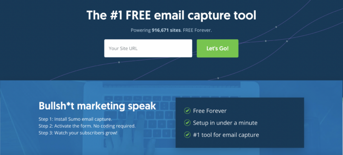
Also, if you have a large number of users, include the number. They have the exact number (916,671 websites) on the CTA, which adds credibility.
Teachable
If you’re looking for a way to make a living online, Teachable’s market is booming.
Their CTA is fairly simple and appeals to an audience of relatively new course creators (which is perfect because their software is designed to be user-friendly and simple).
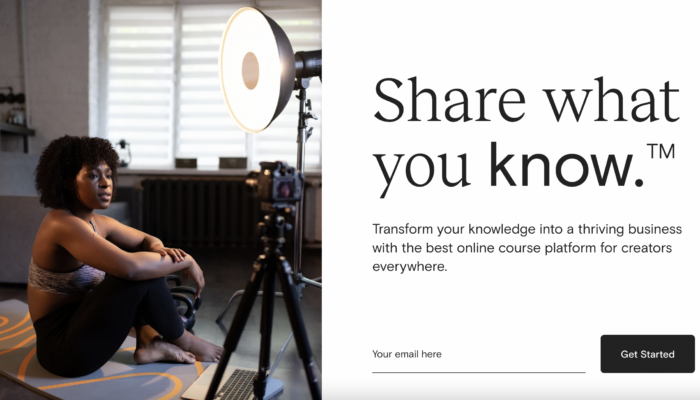
They also emphasize the free trial offer and just ask for an email address to get started.
ClickFunnels
A list of great call to action examples wouldn’t be complete without ClickFunnels.
They are masters at selling, so they clearly have a killer CTA.
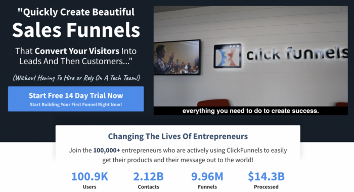
They sell mainly to smaller companies, and their copy hits on the pain points of those entrepreneurs.
First, most new entrepreneurs can’t hire a large tech team, and they just want a simple solution to turn visitors into customers.
In addition, they add a video to the side that essentially shows how the digital product works, rather than explaining it in the CTA.
Finally, the freemium offer makes a soft ask for people to use the software at no charge.
They also use more urgency than the majority of the other CTAs on this list, with “now” mentioned twice and other words like “quickly” to encourage action.
Note that while pressure can work well for some products, be conscious of the marketing story for your brand.
For example, if you offer fertility services, pressuring someone to schedule an appointment will project an insensitive brand image.
However, this works for ClickFunnels because most entrepreneurs consider themselves action-takers.
Pop-Ups
If your visitor sees the CTA on your homepage and then tries to leave, consider using an exit pop-up.
An exit pop-up should also have a strong CTA that convinces the visitor to stick around or at least give you a piece of information that enables you to retarget them (like an email address).
Here are a few great call to action examples on pop-ups.
Adore Me
Adore Me offers a highly convincing B2C CTA in its pop-up.
First, they create real urgency with a countdown timer at the top. In addition, it lays out the discount you will receive (which is a sizeable discount, not just 10% off).
Next, there is a guarantee (free exchanges), and finally, they make the copy on the buttons very convincing.
Most CTAs have a button that says something like “Buy now.” However, this language implies that the customer will be spending money by purchasing something, which can trigger guilt.
Therefore, this CTA, “Unlock My Offer,” implies that the customer will be saving money, which actually moves the visitor away from a mindset of pain.
It’s also more refreshing than similar, fatigued versions, like “Get My Offer” or “Redeem My Offer.”
In addition, the button to close the offer uses reverse psychology to trigger the guilt of wasting money.
HelloFresh
HelloFresh has an interesting pop-up CTA.
Rather than asking the visitor to sign up or do something, they offer a fun interactive experience that then leads them to the first step in the customer journey.
If your visitor isn’t interested in your first CTA, you can offer them a different experience.
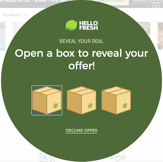
In addition, they use similar reverse psychology that Adore Me uses — the button they want the person to click suggests gaining value, whereas the exit button suggests losing value.
Tim Ferriss
Tim Ferriss also offers a compelling pop-up CTA.
Most people visiting his website are interested in Tim himself, so offering a download with 17 questions that changed his life engages his audience.
Again, a great CTA isn’t about “tricking” the audience into doing something. Rather, it’s about offering what they want — which all of these call to action examples get right.
YouTube
YouTube has been promoting their Premium subscription, and for quite some time now, this has been their pop-up.
Given that they haven’t changed it in a while, it’s safe to assume that it’s converting really well.
The reason why it’s likely converting so well is that it’s a very simple offer: you won’t see ads. The CTA again uses reverse psychology.
The button to skip the trial makes the customer feel pain (leaving something free on the table), whereas the button to continue offers the same sense of relief (gaining something for free).
Starbucks
While this CTA may not be like the others on the list, I thought it was pretty creative.
When you land on the Starbucks website, you have to accept their cookies. However, once you click accept, this clever pop-up appears.
It’s also quite helpful, as it allows visitors who want to order online to get to the order process quickly.
Call to action examples to craft, test, and repeat
Have these call to action examples inspired you to take action now?
Continue to test various CTAs, experiment with different setup copy, and even consider adding media and images.
No one becomes an incredible copywriter overnight. But to start going in the right direction, aim for a deep understanding of your customer’s pain points and pleasures.

Reader Comments (14)
Thanks for this, Tim. For me two other examples of great CTAs are Fresh Books and Netflix.
I completely agree with Freshbooks. They do a great job.
Another great article Tim! I agree that creating urgency is one of the most important aspects to a quality CTA. I find that countdowns provide an awesome CTR with our campaigns.
Good article!
Exit pop-up, how does that actually work?. Is it a landing page for external links?
How else do you know a visitor is leaving?
Can you give some examples of that in the future?
Hey Johan,
Adding an exit popup is generally done by the code in your email service. For instance, we use convert kit and they have a setting specifically for email pop-ups.
Once you hit that setting, you won’t have to worry about anything else. The pop-up wll show when someone tries to leave the page.
I find CTA’s very tough. I’m in the UK and I wonder if there are cultural considerations as in a UK site visitor would be turned off by more seemingly American CTAs like ‘discover’ or find a CTA that is very direct a turn off, such as ‘Get leads now’. I think culture is something to think about.
Hi Jason,
That could very well be the case. I’ve never thought of it that way. Maybe this is an interesting topic for another post.
Hi Tim,
There should be a topic about it, it will be very interesting to know your thoughts on it and i will be looking forward to it,
Amber.
It is never easy to be able to communicate a lot with just a few words, this is a great collection to take inspiration from. I will save it for the future, thanks for your post!
Thank you for so many call to action examples. Homepages are kind of the most visited pages on your website so one should definitely optimize them for conversions and lead generation.
Hi Tim,
This is awesome content on CTA. Thanks for your content.
Basically, I’m a marketing guy.
A few months ago I created a blog on online marketing on the Blogger platform (Google) and published 35 articles. However, I have not yet set up a strong CTA. No POP-UP CTA option was found there.
I would be grateful if you could give me an idea about this.
Thanks Tim. I’m a newbie and haven’t been using call to actions. I definitely have to start doing that after learning about it today.
The Starbucks one is so perfect with all the cookie notices we are constantly seeing!
I think I’ve really lacked a good CTA mindset for getting more email list subscribers.
My list has over 50 and gets a new subscriber each time I send it. So, maybe that’s a sign for me to create a better CTA or copy and it would probably grow even larger.
This is sound advice, Tim! Really enjoying it from all avenues!
Thanks for the great tips! And for providing examples. It’s one thing to know you need a great CTA and another to put theory into practice.
This article's comments are closed.