What if I told you there’s a passageway directly into the brains of your readers — and it doesn’t involve copywriting voodoo, ninja video moves, or podcasting magic?
While it never hurts to learn how to write subheadings, this straightforward method doesn’t involve words at all.
It’s all about visuals.
Hold on. Don’t run off just yet!
I know that using visuals can feel intimidating if you’ve never worked with them before.
But just like you don’t have to be born with a pen in your hand to become a decent writer (I’m proof of this), you don’t have to be born with a special “designer gene” to master using visuals.
Design is about learning a few guidelines and then practicing what you’ve learned.
That’s it.
Design is learnable and if you’re willing to practice what you learn, you can start using visuals to give everything you publish more impact and meaning.
What’s “visual content marketing?”
The broad definition of visual content marketing is simple:
Visual content marketing leverages the power of images to communicate your messages.
Rather than communicating meaning with words, we use pictures.
Why bother with visuals?
Words — whether they’re spoken or written — are given meaning inside the language-processing part of our brains.
That part is busy — and slow.
Images are given meaning inside the visual-processing part of our brains.
That part works much faster.
We can understand image meaning in just 13 milliseconds, according to MIT.
When you combine visuals with words, you get your readers’ brains firing on all cylinders.
Let’s talk about how to start using all that brain firepower, even if you’re not a designer and have never worked with visuals before.
If you’re just dipping your toes into the visual content marketing waters, there’s an easy way to start.
Commit to getting really good at finding the perfect image for every piece of content you publish.
To help you find that perfect image, start with these three tips.
Tip #1: Search only where you have permission
Keep yourself out of legal hot water by only searching for images where you have clearance to use them.
Try paid stock photo sites, like my favorite, Bigstock.
Or search on free stock photo sites like Pixabay, Pexels, or Unsplash.
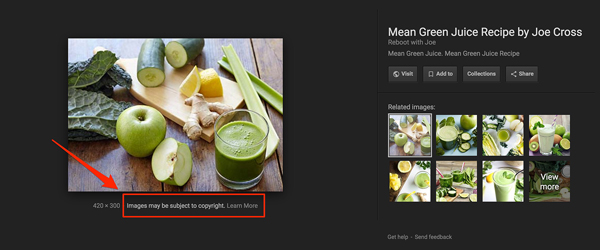
Avoid Google Image Search!
Most images in search results are owned by someone — and swiping them to use in your content could be an expensive mistake.
Google even gives us a reminder:

“Images may be subject to copyright” appears under every image we click on in Google Image Search. Don’t say they didn’t warn you.
Tip #2: Avoid images that look fake
Stock photo websites get a bad rap because of photos like these:

So creepy. On so many levels!
Avoid stock photos that are contrived, overly retouched, or too “perfect” with their lighting, models, or poses.
Your readers will find it easier to engage with people who look like them: real.
Choose images with people who look like they’re taken off the street, with lighting that’s natural, and situations you’ve actually seen in real life.
Tip #3: Don’t chop off heads
There’s a trend happening lately — I call it the “headless craze.”
Using a “headless” photo represents a lost opportunity.
You see, as humans, we’re hard-wired to respond to faces. From the time we’re babies, we learn to “read” and respond to the expressions made by our caregivers.

We learn early on to accurately interpret what faces communicate at a granular level.
Even at a young age, we can tell the difference between:
- Joy
- Disgust
- Focus
- Distraction
- Pleasure
- Pain
And much more.
When you use an image that doesn’t show a face, like this:

… you’re missing out on a ton of context. We can’t read this person’s face — it’s not there!
Instead, look for people photos that give us more information by including the expression on the model’s face.
Like this:

I’m going to stop here because I don’t want to overwhelm you with too many tips.
I promise I’ll be back to share more visual content marketing information in future posts on Copyblogger.
In the meantime, are you ready to level up your visual content?
Beyond the minimum: How to put images to work promoting your content
If you’re ready to get visual content marketing working for your business, here’s the logical next step.
Go way beyond just adding images to your content when you learn to “brand” your images with your fonts, colors, and logo — just like what Copyblogger does at the top of every piece of content published here.
The advantage of creating a branded image is that it becomes your website’s visual ambassador.
It reinforces your brand wherever it appears, which could be:
- At the top of your blog post, your podcast episode, or on the splash screen of your next video
- On social media platforms, so your content stands out from the crowd
- In your email marketing, to reinforce your visual brand
I call these “signature branded images,” and they’re within the reach of anyone to create.
I know because since 2017, I have taught people just like you to create them.
These students — who thought they “weren’t artistic” enough — have mastered the method I developed and become confident visual content marketers.
Register for my free, on-demand workshop
To learn more, I’d love to invite you to my on-demand workshop, Brand Your Business with Stunning Visuals in 30 Minutes or Less!
It’s free, and you can start watching (and learning) in just a few minutes.
The workshop is chock-full of dozens of examples of these “signature branded images,” including images I developed for the Copyblogger blog.
When you’re ready to go beyond the minimalist approach and learn a step-by-step method to master visual content marketing, register for the free visual marketing workshop.
Editor’s note: Copyblogger is an affiliate for Pamela’s workshop.

Reader Comments (23)
I love Bigstock too. I have been at the 7 download tier for months, and I don’t always use all the pictures, but when I do need one, there is always one that conveys what I’m trying to say. Or at least, I think it does.
Kari,
It’s tough to know exactly how your photos are coming across, isn’t it?
One thing I recommend to people searching for photos to use in their marketing is to look for images that depict the transformation you want to show.
These feel aspirational — people see them and think, “I want THAT!”
Hey Pamela,
Though I am from a design background some of the mistakes with my visual content marketing effort that are thought to be among the non-designers have cost me a lot. However, I agree with you with having images that appear fake would look creepy and off to the eyes.
Hi Paul,
There’s always time to learn and improve! Glad you enjoyed this article and got something from it, even though you have a design background.
Hi Pamela,
This is very useful stuff. I am still learning how to create images for my site. Gradually getting better…
I use Google to search for images then click on Usage Rights and click Labelled for Reuse. I have been assured that these images are free to use. Please tell me they are or I have a lot of work to do…..
I also use Canva to design images. This is just a fantastic app.
David … I still stay away from those.
Going forward, why not explore the free stock photo sites that gather all those free-to-use images for you?
#1 is a biggie Pamela. I only use my travel images. Good deal: I have thousands upon thousands to choose from.
Creating your own original photos is powerful! Glad to hear you’re building a visual content library, Ryan.
Hi Pamela,
This is fantastic advice.
I am a new blogger, and recently using Instagram and Pinterest too. Well since August 2018.
Totally agree with the headless pictures being a No No.
However, I have been using pictures from my Pinterest Boards and referencing this in the captions. Is this okay?
Not sure what you mean about using pictures from your Pinterest boards? Do you mean screenshots?
Sorry should have made it clearer.
Yes … can I use screen shots?
I’m not a lawyer, of course, but I believe that using screenshots in an editorial sense (as a demonstration, to teach, etc.) isn’t a problem.
To be 100% sure, though, research exactly what you plan to do so you’ll stay out of trouble!
Thank You Pamela for your time and responses.
Hi Pamela, Thanks for the post. I’ve been using Pixabay and Pexels but found out about Unsplash today. Gotta check it out.
And I do agree with Tip 3, I’ve noticed that faceless photos don’t often evoke an emotional response which indirectly hampers the marketing campaign most of the time.
Glad you found this helpful, Rubial.
Great tips, Pamela! When I see fake images, I lose trust in the content, and I leave this page almost immediately.
Visual images are really helpful, especially in long-form content. I try to use one image for every 100-150 words. And my readers are delighted, although my blog posts are always more than 5,000 words
Adding images to break up long content is a FANTASTIC way to hold interest!
I totally agree with this article. Pictures are really powerful and they to energize the viewers thoughts and I believe they help to increase the time someone spends on a website. That 3-5 second rule is something that everyone should know about. If you don’t capture the viewer fast, you will probably loose them.
Agreed, Richard. It takes some extra effort to gather images that compliment your words, but it’s worth the effort.
Hi Pamela,
Ooh, I love the info about headless photos. I see these all the time. I won’t be doing that again… thanks for the “heads-up.” (sorry, couldn’t help myself)
Branding blog images is such a great tip. I recently started doing it on my business blog. I was influenced by Copyblogger and Kate Toon.
I’m not a visual designer, so I tried Canva. But I couldn’t get it to feel like my brand…
So, I tried putting together a few ideas with colour, shapes, and fonts on Keynote. I then copied the shapes into Photoshop (to form a frame-y thing), put a bit of text over some collages I made from stock images, and voila – branded blog headers!
It was a challenge at first, but now that I’ve done it a few times and created a template, it’s become much easier.
A nice professional touch. Thanks for the tips!
Cheers,
– Dane
That’s a great workaround, Dane. Sounds like you’re having fun with them!
Thanks. I am. Maybe a little too much fun at times… but that’s alright. As long as it doesn’t take me longer to do than actually writing the article haha
Some really good suggestions. It’s amazing how many website have inferior images. Whilst it seems like common sense the points you make above are really valid.
This article's comments are closed.