This is another addition to our ongoing series of tutorials and case studies on landing pages that work.
Karen Omerod wants babies to be more comfy and parents less hassled dressing them. She’s designed an adorable line of yoga-styled, easy on/easy off, tops and bottoms. What’s not so cute is that Karen’s sales are poor.
She understands her market and has tested a little advertising, but not much is happening. Let’s see what we can do to get more babies into IGrowKids togs.
- The Goal: Generate 2 sales per day by May 2010.
- The Problem: Less than 2 sales per week currently.
- The Current Landing Page (homepage): http://www.igrowkids.com.au
- Value: $28.95 including shipping (AUS $)
The Maven’s 10-Point Critique
#1 — Get visitors directly to what you’re selling. Clarify your navigation.
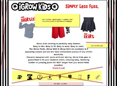
Dump the splash page. It stops your visitor’s momentum in the search/shop process and forces them to read when what they want to do is browse and shop your clothing line.
Also, do not use the “makes-my-eyes-go-crazy”, black and white striped background and too-clever icons. You want clear, obviously labeled, and intuitive navigation links. I found myself irritated having to click each icon to figure out what they were about. Use recognizable social media icons, as well, for the same reasons.
#2 — Think like a bakery. Get your tasty goods upfront for a wide variety of buyers.
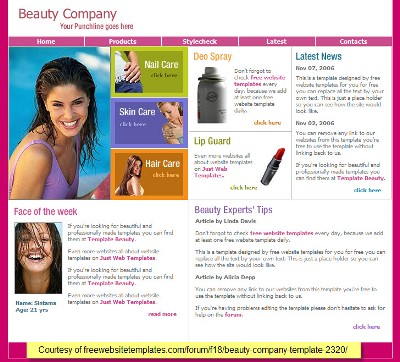
I’ve provided a basic e-commerce template that shows what I mean. Break out the goods and get them on a rainbow of smiling babies, toddlers and young kids. Your establishing image could be seasonal or reflect a holiday. Use the other boxes to showcase a testimonial, a special offer, sizing info, and/or useful news and information.
#3 — Invest in your imagery on the homepage and product pages.
Quality images are the key to clothing sales. Your visitors are going to look at your homepage photos and decide in 2-3 seconds if you’re a quality place with quality clothes. You need to show the clothes on the kids so moms and grandmas can imagine their little ones in them, too.
For the product pages, you can show one child wearing a sample and then the rest of the colors as mini swatches. (Ideally, it would be great to show the pants change color on the kid models but that may be more technology, time and cost than you may want to invest right now.)
Ask your Facebook fans for pix of their kids wearing your clothes and get them on your pages. (Make sure you get all the proper permissions and don’t display personal info.)
#4 — Focus on your value proposition more strongly.
“Simply less fuss” is a good start but, again, lacks the clarity and specificity you want here. I’d suggest:
Perfectly easy fashion for kids who dig comfort.
This simple declaration will appeal to moms and dads who want their kids to look good and feel comfortable — yet want clothes that are easy to manage at diaper-changing time and on laundry day.
#5 — Capture your visitors’ hearts and imaginations with a strong headline.
Why are your visitors there? What are they looking for? Maybe it’s simple like a “Summer Madness Sale” or a little less emphatic — “Little Girls Welcome Spring in their I Grow Skirts.” Your headline, like your establishing image, will and should change through the selling year.
#6 — Rethink your navigational scheme.
I’ve already discussed the “rebus” navigation icons you’re currently using. Well, after you dump them, please move the primary navigation to the top where visitors expect it to be. Then let’s rework the content based on those core points all prospective customers care about. I’ve identified primary navigation links and secondary.
What are you selling? [TOGS]
- Who are you? [ABOUT US]
- Blog & Connections
How do I order? [ORDER INFO]
What about special requests? [FAQ]
- Who else has ordered from you? [RAVES!]
- Is my personal information safe and my privacy protected? [PRIVACY POLICY]
How do I contact you? [CONTACT US]
What if I don’t like it? [RETURNS & REFUNDS]
You can lump order/shipping info and returns/refunds under CUSTOMER CARE. However you ultimately organize and title the links in your navigation bar, make them clear and obvious.
#7 — Reorganize your product pages.
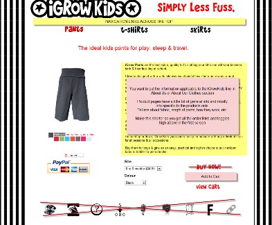
Save the general info about I Grow Kids clothes somewhere else. Product pages should sell and offer specific details about the product itself. For example, on your Pants page, I’d write a headline like: “Snazzy, easy wear pants for boys and girls bring smiles!”
Then concentrate on pants details: fabric, measurements, colors, etc. I might also add a testimonial and a link to sizing instructions or a visitor-initiated pop-up with useful details. Get the calls to action higher on the page.
Lastly, change “Buy Now” to “Add to Cart” — folks are still shopping and thinking. Don’t rush ’em.
#8 — Make prospects feel comfortable and confident about doing business with you.
Moms love entrepreneur mom stories — tell yours! Share where you’ve advertised — link to those sites. Be more aggressive with social media — ask prospects to connect with you.
Add “Reviews” to your product pages. Chase customers for their testimonials. Offer $5 discount codes to customers who do. Reviews/testimonials are super important to fence-sitting prospects.
#9 — Make it easy for shoppers to find what they need fast.
Everyone shops differently — by sex, by product, by color, by size, by price, etc. Make it easy for them and organize accordingly with mini-search boxes. Add a site-wide search box that displays on every page and a sitemap, too.
#10 — Do the SEO to generate organic search engine rankings
SEO is all about using the words, terms, and phrases that your prospects use. The key is to find the sweet spot where your niche customer finds your niche store.
Here’s your current homepage meta “title”:
<title>iGrow Kids Clothes. Yoga & ballet-inspired clothing for baby, toddler and junior boys and girls</title>
If you want to generate more traffic, you need to know what your best prospects are looking for and put those phrases first in your <title> tags. Here’s one way:
<title>Comfortable, Easy Fit, Yoga-Inspired Child’s Tops and Bottoms :: IGrow Kids</title>
You’ll want to do your keyword research to identify those phrases that generate the kind of customers you want. You want the crunchy granola moms? Focus on organic and Yoga. Want moms like me who want everything easy? Focus on terms that communicate easy-peasy. Want moms who appreciate value? Focus on words that are all about long-wear, value, never outgrow, etc.
Remember to give each page its own title and meta description.
There’s a lot more to learn about SEO. But you’ll be amazed at how effective just adjusting the titling can be.
BONUS: I never reinvent the wheel unless I’m forced to. I always suggest to my clients they find technology that does a good chunk of the work for them, especially when they’re first starting out, so they can concentrate on business and not site-building. There are a ton of decent e-commerce solutions available to you, including WordPress CMS and few plug-ins. Take a look around and see if there isn’t a turn-key system that could do a lot of the heavy lifting for you.
My thanks to Karen Ormerod for her support of Heifer International. Look for my next makeover in about 4 weeks.
Want your own Copywriting Maven landing page makeover?
Got a landing page that’s more poop than pop? Need to get better results from your online marketing?
If you’re interested in a private page makeover, site audit, or other services, please email Roberta directly.


Reader Comments (40)
Hey Robert,
WOow Excellent post bro. These are some awesome tips.
“Make it easy for shoppers to find what they need fast.” Great .. exactly right. Easy navigation,desgin and headlines are very important factors of landing page.
Btw. Point 8 and 10 are awesome
Thanks for sharing this great post :).
Those pants look so comfortable- I’m really tempted to buy some for my daughter! And i love the idea of adding designs to the t-shirts.
I really like the text you’ve used for the menu navigation, but I would recommend losing Twitter and Facebook from the top level navigation, and spacing out the links more- because they’re such a heavy font they need more space.
I wholeheartedly agree regarding the photos- you need some nice big model pictures! Think about the kind of pics that big clothing sites use (Old Navy comes to mind)- nice crisp shots on white backgrounds.
You don’t mention if you ship to Europe (probably too expensive)- but I’m definitely tempted!
Good luck.
Kelly
Hey, Dev – feel free to call me ‘sistah’ – and you’re very welcome!
Great pointers Roberta. It’s very important that you make the strongest point on the landing page and remove all distractions.
~~ Sarah ~~
Really helpful information for better organizing and directing your reader/buyer/browser. I’m going to think this over and apply some of it to my site.
Hey Roberta,
This is excellent on how you broke it down for us. I would like to see more post like this.
Chat with you later…
Josh
This was a great makeover/review. I struggle with making it easier for shoppers to find things.
Looking forward to getting my makeover
Michelle
I would add a picture of the baby wearing the stuff (show the goods in ACTION), since the images look like adult clothing. Perhaps have a picture of an adult doing some kind of yoga pose with a lightbulb over their head (showing how the idea was generated).
People love to read about the story BEHIND the product they are buying (preemptive marketing). We can thank good old Claude Hopkins for that, and later Jay Abraham.
Make the buying process REALLY easy for your customer.
Roberta, as always, great crit. I especially like your line about “being like a bakery.” I am afraid that I must steal that and use it on some future post somewhere… great quote.
-Joshua Black
The Underdog Millionaire
Oh, and one more comment- the customer needs incentive to buy RIGHT NOW and not come back later for more browsing. Perhaps you can show bundled pricing…if you get two tops by the end of the month, you get the pants free etc.
The sale is the most fragile even in business, and if you allow for any reason that the customer can lose focus on the end goal (buying lots of stuff), then you will lose the sale.
-Joshua Black
The Underdog Millionaire
The only issue I have is with the T-shirt page. There appliques that you must choose for the T-shirt (no option to buy without one but nowhere is a picture of a t-shirt with an applique. Without knowing where and how big the applique is, I wouldn’t order the shirt. Aside from that, everything looks good.
Love it, and the thing is I think most people are insecure about putting their best products out in front for people to buy.
I just went and looked at the current home page, and there’s a tiled grass background (not showing up in your screenshot). The tiling looks messy and takes up space that could be filled with happy kids and product shots.
I agree the site needs more sorting options – boys, girls, customer favorites, then by type of clothing (tops, skirts, etc.)
Have your customers tell you which products they like best (maybe vote them up or down), or feature a special on those.
LL Bean in the US does this really well. Go have a look at their site and see if you get ideas.
Those pants do look comfy though. In adult sizes, they’d be perfect for freelancers (a step up from jammies).
@Jodi, the thing about the tiling is that on the resolution I use on my laptop, it’s barely visible, just a sliver. There’s not enough real estate to do anything like a product shot.
#2 and #3 would bring a lot of value. It’s hard to visualize exactly what an outfit will look like — how long are the pants, how big is the applique on the t-shirt, etc. Plus, of course, parents are hard-wired to melt at the sight of cute little kids.
I notice that Karen has already implemented some of the navigation improvements, and the site already looks a lot better than it did in Roberta’s screen shots.
@Jodi – I write the makeovers sometimes 2-3 months in advance of publication, but give the makeover summary to the participant right away.
HI Roberta,
Great information.
I think to many people get caught up in
things that really have nothing to
do with making a sell.
Over the years, it has been amazing how things
have changed on the net.
The basics you laid out are great.
Thank you for your contribution
Jeff Faldalen
The Prospecting Funnel Guy
Hey, Jeff – thanks. Technology changes, the human heart does not. We all want to seek pleasure and avoid pain. The rest, to paraphrase the Jewish philosopher, Hillel, is commentary. Go and study … and don’t forget to test.
@Sonia, on my big Mac screen at 1650 x 1080 (yes, I’m a resolution pig) it looks like there’s a thin white stripe on the right hand side.
@Roberta:
>>The rest, to paraphrase the Jewish philosopher, Hillel, is commentary. Go and study … and don’t forget to test. :)<<
Do I have to stand on one foot? I wonder what Hillel would make of the Internet…
Good points, Sistah !
The home page is crying out for photos of cute kids wearing the clothes.
Right now it’s not even clear that the clothes are for sale. Showing some prices will be a clear signal that we can buy and also says that they are good value.
I’m guessing that her value proposition is “clothes will grow with your kids”. It’s worth testing this to see if buyers actually want this feature – and if they do then go big with it and lose some of the secondary messages like “easy-this-that-and-the-other”.
You can test different value propositions on a low budget by putting them in AdWords copy and seeing what people click and what they ignore. A bonus is that some of the clickers will also buy – but the main idea is to see what real-life people are interested in.
G’Day Roberta,
Good to see you giving an Aussie a “leg up.” Your “Think like a Bakery” line is a gem.
If Copyblogger published only rubbish–which of course it doesn’t– it’d be worth subscribing to just for your makeovers.
One of the problems we have Down Under is that we have lots of web designers who think that they know lots about marketing but who simply don’t.
Keep up your excellent work and…..
Make sure you have fun.
Regards
Leon
Just woke up down under here to see the post up and some fabulously helpful comments! Thank you not only to Roberta but to everyone who took some time to take a look and add to her review.
I am an at home mum and http://www.igrowkids.com.au is 100% designed and built by me on my little 6 year old PC using open source software….and it has taken just over a year to learn the web technology and design the site. I have to say it is very easy to get a little lost in the woods and loose sight of the customer experience while emmersed in CSS tutorials! It is hard to express just how valuable it has been to me to get some objective, professional critique.
Thank you thank you thank you! ….. right, now to brief my photographer….
Karen
@Jodi – Hillel would love the internet. Not so sure about Shammai.
@John – excellent points. I do recommend clients use Adwords to cheaply test copy points and value props, but only if there’s enough traffic to get a valid result.
@Leon – You flatter me, Leon. Keep up the good work. I love all web designers, as long as the work looks good and more importantly, supports the marketing message.
Hi Roberta,
Great post with excellent points.
You could easily use the points for any site you are making whether it is a simple auction post or a full online store, they are valid for both.
Looking forward to reading more.
Regards
Simon
@Simon, you’re right. The key points remain true no matter what kind of site/landing page you’re working with.
I wish everyone was following these tips and website visitors would be happier and spend more money.
Here are some tips from me:
Gallery page: don’t show it it if you don’t have content yet
Font: Times New Roman is not very nice what abour Arial or Verdana, it pleases eye bit more
Web page titles and SEO: Every page should have different title
My email is michael@elaunch.com.au if you have more question regarding html/css or seo
I hope it helps.
@Roberta:
LOL! I’m no Torah scholar, but I think Shammai would have said the Internet was not halachic and that it was forbidden.
@Jodi – which is why Hillel’s camp wins once again.
Amen!
Roberta,
Thanks for your time and insights again.
Karen,
Several remarks on resolutions and browsers were made already. Cosmetic issues are one thing, but on my tiny netbook screen, the Add to Cart button was actually hidden behind the View Cart button! The Size drop down menu was not visible at all.
Here’s my screenshot:
http://www.twitpic.com/1rtrt0
Great tips, and I totally agree that it would be really helpful to see kids having fun & wearing these clothes on the landing page.
This is super helpful to read over reviews like this for other ecommerce sites. I just launched a new online shop myself, just over 2 months ago, so I’m still trying to tweak and add things and make it as easy to navigate for the customer as possible. Thanks for the ideas!
I might have missed this, but why did you swap out the “Buy Now” text for an “add to cart” button? Was it just to go for a softer sell?
Ken, it’s not a softer sell. The word “buy” usually converts worse than other options. It’s been tested a lot.
As Brian so aptly noted, the “Buy Now” vs “Add to Cart” has been tested hugely and Add to Cart generally gets a better ultimate conversion. If you think of selling as a process of romancing the prospect, Buy Now is akin to “Let’s Get Married” where Add to Cart is more like “Let’s Have Dinner.”
As my dad used to say, it’s all about the timing and quality of commitment.
My ‘To Do’ list has flipped another (A4) page here! Love the specifics I am getting from all your comments. Thanks to those who have offered further help – you’ll be hearing from me!
@Ken, @Roberta , @Brian : thank you for bringing up the Buy Now Vs Add to Cart. I have never even thought there may be distinction between the two. Our site is seasonal – yep, we sell Christmas stockings, so about this time of a year we usually start on upgrades to get ready for the Christmas season which usually starts in October. So Buy Now is out and Add to Cart is in.
Roberta explained better than I did… in that sense, “Add to Cart” is a softer sell because it continues the seduction rather than abruptly requesting consummation. But it’s an approach that closes more deals, which to me is a stronger sell.
One further thought … if you’re selling something with a big discount and a tight deadline, I’d seriously test ‘add to cart’ vs ‘buy now’ – in the latter case, the urgency of ‘buy now (or miss out)’ makes a stronger emotional appeal. But for general ecommerce shopping, I’d stick with ‘add to cart.’
There are a couple things I picked up on this post, that inspired me to restructure one of my sites. Thanks for the amazing tips!
This article's comments are closed.