This is another addition to our ongoing series of tutorials and case studies on landing pages that work.
Nicole Johnson wants to get babies and their moms some much-needed rest. She’s packed napping plans, schedules, and strategies into her $37 ebook/consultation package. She’s tried different pricing, Google Adwords, different offers, freemiums, and more to pop conversion, but her results still ping between a snoozy 0.5 to 3%.
She has good traffic, but needs more help getting those tired, sleepy moms to buy. Let’s see if we can’t help Nicole give her sales a much-needed wakey-wakey.
- The Goal: Increase conversion (currently below 4%).
- The Problem: Nearly 3,000 visitors monthly, who show an interest in the free information but don’t ultimately translate to sales.
- Content Marketing Strategies: Various. Nicole’s free Baby Nap Guide is one piece she uses to get users into her email funnel
- The Current Landing Page: www.babynapswell.com (home page)
- Value: $24.95 to $37
The Maven’s 10-Point Critique
#1 – Your first screen has to answer the question — Why do moms want their babies to nap?
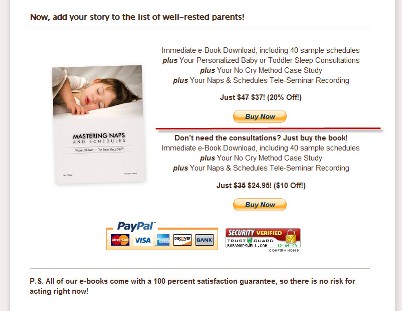
Because they’re exhausted! They want a relaxed, rested child and a chance for themselves to rest and recharge for a few hours. They’re desperate for RELIEF and they want it now.
What’s the deep, realized benefit to your ebook? Your ebook helps break the vicious no nap/irregular nap cycle, makes mom feel more competent and secure as a parent, and makes it easier to enjoy her baby.
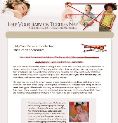
So here’s the problem — you’ve got 2-3 seconds from the first screen to get your reader involved in your message. Perhaps they’ve already reviewed the free nap info, perhaps not. In either case, you don’t present them with a rich, emotionally resonant headline. You’ve basically repeated the banner head as if it was a headline. It’s not. At first glance, I also have no idea you’re selling anything at all. It isn’t clear to me.
So be clear. Develop and test your headlines that speak directly to the mom’s emotional environment — Too tired to enjoy your baby? Dread the nap-time power struggles day after day? In just XX days, you CAN turn your pint-sized nap-fighter into a sweet-smiling, nap-lover. All you need are the right strategies and tools . . . and so forth.
#2 — Get personal. Get emotional. Talk to your readers, Mom-to-Mom, in a letter format.
Dear Cranky Mom,
A few years ago, I was just like you. I was a new mom with a new baby that no matter what I did wouldn’t nap or when she did, it was short and fitful. When this kind of stuff goes on too long, even the most confident mom in the world begins to think she stinks at this mom thing. I was sure I was doing something wrong but I didn’t know what to do instead.
Your current copy is factual, but a little bloodless. It doesn’t speak to the heart and the desperation that I know I felt when my kids were little and wouldn’t sleep. If ever there was a problem/solution fraught with anxiety and a deep need for help, this is it. Make sure your copy reaches the frazzled mom with solace and hope that she will, once again, get a chance of closing her own eyes for an hour or two in the afternoon.
Get personal with video. I think this could be very effective for you, especially if done professionally. (I don’t think a simple chat to the webcam would support your value or credibility.) Imagine how wonderful it would feel to “Tired Mom” to have someone talk right to her and tell her that relief is in sight.
#3 — Make the case why napping issues need a $37 solution.
There are a ton of books, sites, products, and even support groups devoted to sleeping issues. I wondered why I needed a special book about napping as opposed to a broader sleep solution. That’s probably the biggest challenge you have to overcome. You’ll want to make sure your copy continues to underscore how the daytime napping problems are different and need a different set of strategies to solve them.
#4 — Show and tell the product you’re selling. Put your first call to action in the first screen.
If you want people to know you’re selling a book, you gotta show them the book and YOU’VE GOT TO SHOW THEM THE TITLE. I didn’t even realize your ebook was called “Mastering Naps and Schedules” until I saw it mentioned in a testimonial at the end of the second screen.
Your cover is very appealing so I’d definitely give it above-the-fold prominence, perhaps working it into the banner art. You also need to give your prospects the opportunity to order at several points in the copy, starting with the first screen. You want one button, text link or other call-to-action (CTA) device per screen scroll. (Right now, it takes me 3 screens to locate the order buttons.)
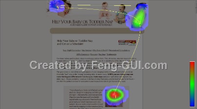
I prepared a heatmap so you can see what people look at and what they look at first. Too much attention to elements that don’t promote your message means lost sales opportunities for you. (Free heatmap courtesy of the technology at Feng-GUI.com.)
#5 — Tell me precisely what I will get and learn from your ebook.
Give your readers a bulleted list or two of goodies, and be specific.
- 28 proven strategies that will . . .
- 3 easy-to-use tools that make . . .
- 12 ways to get well-meaning grandma off your back . . .
Etcetera. Nothing strengthens copy more than specificity. You already do some of this. Do more.
Also, take the feature and expand it into its core benefit. For example, “How to get LONGER naps” becomes “10 ways to get longer naps from your baby and more couch-time for you.”
#6 — Emphasize that your system works for nearly all babies and parents.
Everyone, including me, thinks their baby and parenting situation is unique. That’s why you’ll want to make sure your copy reinforces that your system works for nearly all young children — preemies, internationally adopted toddlers, twins, and also that it works for all sorts of moms and dads. Use your testimonials as a way of underscoring this.
Think about personas representing your customer types. Who is this ebook really for? Write out 3-5 ‘stories,’ each representing a key member of your core parenting market, and make sure your copy delivers the message, “Yes, this ebook is perfect for someone like me,” for each one of them.
#7 — Establish and reinforce your expertise on the subject. Add a headshot.
Who are you and why are you qualified? That’s another one of the big challenges your copy needs to address. Unless I missed it, I don’t see anything about you. If you want me to spend $XX, I want to know enough about you to think I’m spending my money wisely. You don’t have to have an alphabet soup of degrees following your name, but you do need to reveal something of yourself and background within the context of your offering.
#8 — Edit, edit and edit some more.
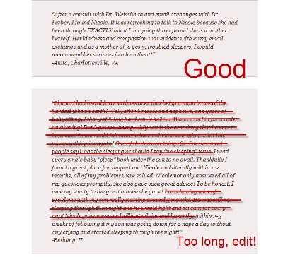
Your moms are tired. Their eyes are glazing over looking at dense, forbidding text in super long paragraphs.
Think shorter, 2-5 line paragraphs. Use lots of subheads and bulleted lists to hook the eye and make scanning and scrolling less like a chore. People only need the science/other background about napping to support your ebook’s information. Don’t give more background than is necessary to help folks make a decision to purchase.
#9 — Test a 2-column format. Load your sidebar with testimonials.
Get the bulk of your “Mom-and-Baby-Tested” testimonials here. Again, edit these judiciously. You want each of these to amplify and illustrate your ebook’s core strengths. I’d also get some pediatricians, pediatric nurse practitioners, daycare center directors, home daycare moms, etc. to weigh-in with their big thumbs-up. Run these short, punchy kudos adjacent to your main copy.
#10 — Simplify the offer.
You need to differentiate your offers more emphatically with titling– “The Deluxe Complete BabyNapsWell System with Personal Consultation” and the “Standard BabyNapsWell System” — and with better design. I might box these and play them side by side. Perhaps add your headshot into the Deluxe box as a reminder of the relief AND personal attention your prospect is about to purchase.
BONUS:
I’d think about giving your ebook a new title. This is a huge topic for so many parents living in the fog of “my baby never sleeps.”
“Mastering Naps and Schedules” lacks the emotional juice of “No More Naptime Tears: Get Your Baby to Love Naptime So You Can Love Yours” — or something like that. You want a title that clearly, perhaps cleverly gets the point across fast. You want your title to spell RELIEF IS AT HAND.
My thanks to Nicole Johnson for her patience and support of Heifer International. Look for my next makeover in approximately 3 to 4 weeks.
Want to get a future Copywriting Maven landing page makeover?
Got a landing page that’s more poop than pop? Willing to share with Copyblogger readers? Prepared to put a little of your own “skin in the game” for a Maven Makeover? Then follow your click to Maven’s Landing Page Makeover page for all the details. I’m booked for gratis “Heifer” critiques until 05/15/10.) If you’re interested in a private critique/makeover, site audit, or other services, please email me directly.)
Reader Comments (43)
Just as an update – BabyNapsWell has been updated using many of the recommendations I made when this makeover was written. Site owner is seeing incremental increases and we’re continuing to tweak based on results.
That was quite precise Roberta. Yes these fundas are quite clear when we talk about them but how to apply and execute is another game all together. Establishing oneself as expert, communicating as a friend and throwing an offer as a cult. That makes a great deal in online success. Do post the final results that this baby achieves
Amazing! I can’t wait to see what the new conversion rates are.
Thanks for sharing all the great tips we can apply to our own sites.
It already looks so much better. It’s clear, easier to navigate and it highlights the most important selling points in a much more compelling fashion. Nice work!
Just a question, so this person was seeing 4% conversion – does that mean there were about 120 people purchasing the ebook each month (out of the 3k visitors?)
Very nice review and very smart information.
I sympathise with Nicole’s problem. It has bugged copywriters since time began. May I suggest that she does a lot of split testing.
She won’t lose by split testing because her market is forever renewing itself with new mums. But what she will gain is a clear understanding of what works for her.
Great article, Roberta! It’s nice to see you take the makeovers one step further than just critique and more into the land of “makeover.”
@Roberta Thank you for your makeover and work with the changes!
@Himanshu Exactly. That’s why I hired Roberta to help me execute.
@Scott No, the conversion rate is around 1.5% per month. I felt with Roberta’s help, we can get it to 4-5%, but we’ll see. We are continuing to tweak and test.
@The_Communication_Cycle Yes, I do plan to do split testing, too. I wanted to get a baseline with the new copy and then will test different titles + copy versions.
Great suggestions! I found myself nodding over and over in agreement I don’t even HAVE a baby and now I want to buy the book!
Hi Roberta,
Great article and makeover. Thank you very much. What I saw you do was implement many things I knew in theory. It really helps to have real live examples to understand how to do a landing page.
Thank you!
Julia
Amazing post!
I am writing a soccer ebook and I had an idea of my future website but the post clarified all, format and content.
Now that was cool! A First for me. I may have to make a slight change on a landing page or two myself. Good job Roberta.
@Julia, that’s one thing I love about this series, having a concrete example makes it much easier to really see the technique in action.
julia:
I’ve just completely rebuilt a site I’ve had for the last 7 years and am just in the process of launching a new one in a new field.
Quick question: I’ve removed almost all testimonials and instead have begun using “As Seen In” which is a graphic of all the professional journals that my articles have appeared in.
Isn’t that a more powerful approach than testimonials which I have read are becoming more and more discounted by web visitors?
Thanks.
Patrck Mcevoy
I don’t see why you wouldn’t have both types of confidence boosters. They complement each other and provide ‘sweeteners’ for two different kinds of prospects.
As far as discounting testimonials – prospects will ignore vague “It’s great!” AS in Illinois types of testimonials. But a strong testimonial with specifics provided by a real person or ‘name’ (like Brian Clark, Copyblogger – or moi) would carry far more weight and certainly not be ignored.
This landing page makeover is great. I’ve got a few new improvement ideas for my own free report landing page at the same time.
I agree that the title “Mastering Naps and Schedules” is quite unclear to me. I didn’t really know what it’s about by just reading the title.
I’d also suggest to add a picture of a mom and baby sleeping together. Moms want to have more free time doing their own stuffs when the baby is asleep, but more importantly moms are having lack of sleep because the babies cry too often in the middle of the night. I think it’s great to emphasize that you as the mom get to sleep like baby too.
Our newborn only woke up 7 times last night… I’m very much looking forward to her getting on a better schedule.
This is a great post with clear examples… Nicole, thanks for putting yourself out there…
@Ken Is the book title as confusing when you find it by searching for help with your baby’s sleep / naps? I chose not to implement this suggestion just yet as it means changing a lot of e-mail copy, book cover, etc. I wanted to see how all the other changes affected conversions and may do this later to test the impact. Good idea on the image of mom & baby sleeping. Thanks!
@BrianJ I hope your newborn falls into a nice routine and if not, you know where to find me.
@Global_Micro_Brand Obviously, I’m not an expert like Roberta, but as a consumer “As seen in” is certainly good but when I’m asking myself whether something is for *me* another testimonial from someone *like me* might have more weight. In general, making me feel more confident in the product will go far. Good luck!
Definitely get the picture of your cover above the fold, right near the headline area will help. Even though your customers are buying a virtual product, they want to see what they are buying. We all want to see something in a book’s form to gain emotional attachment to the purchase.
Also, I like to include the actual table of contents for the e-book, in addition to bullets. It shows the customer exactly what they are getting themselves into, and it really decreases the returns.
Only show images of babies sleeping soundly. There should not be a single awake baby in the whole thing. Only show an awake mom.
Joshua Black
The Underdog Millionaire
G’day Roberta,
Congratulations: to you for your excellent advice; and to Nicole for, as we say Down Under,”sticking her neck out” to benefit all of us.
I couldn’t improve on your advice. But there’s one specific issue worth emphasising. It’s the difference between “features” and “benefits.”
A quiet napping baby is a great thing. Believe me. I’ve had four and six grandchildren.
But the benefit isn’t the sleeping baby. The benefit is what the parents are able to do because the baby sleeps through.
A car that gives “50 miles to the gallon” is extraordinary. So is the money you save on gas. But the benefit is what you’re able to do with that money.
I don’t pretend to imagine the benefits a couple might reap from nights uninterrupted by waking babies!
But they’re the real benefits of buying Nicole’s book
Regards
Leon
Leon, I agree … the benefit is the break for (usually) mom and a happy baby when awake. As the mom to 3 – who worked FT at home with all 3 – the ability to close my eyes during naptime was the only thing I wanted.
Roberta,Thirty years ago I would’ve asked if I could “build on your idea.” You have sparked another thought.
Another major beneficiary of our napping baby is the partner of the well rested mom.
Here are a few wild notions;
“How To Destress The Mother of Your New Baby for Only $37”
“Is Your Beloved New Baby Wearing Your Wife[!] Down to a Frazzle?”
“Want to Regain a Relaxed Wife and Rediscover A Smiling’
Happy Baby?”
They’re all rough and ready but I’m sure you get the idea.
Regards
Leon
Um, I like your style, Leon, but I’m thinking it’s the bleary-eyed moms looking for nap-time relief who’ll buy and read this ebook. (I can see dads buying it, handing it off to their wives and partners and saying, ‘here, read this.’)
Leon, that’s definitely a great idea, to target the partner of a mom. I believe though Nicole’s target audience is the moms who are having trouble with their baby sleeping schedules. To add the partner element would dilute the focus on the offer.
It’s definitely something to keep in mind for future reference, but I’d think the best way is to focus on your ideal customer (moms). Maybe something like “More relaxing time for you and your husband”, “Destress Yourself and Rediscover a Happy Family”.
@Nicole, if I’m searching for help with my baby’s sleep / naps, it might make sense but I don’t really know how the moms surf the net. I just think that it’s not 100% clear to me what you’re offering by looking at your title, although I could make a pretty good guess.
And I agree, test and see how things go before changing anything. I know it’s a pain to have to change the cover and stuffs! Good luck with sales, keep us updated with your progress (at least the conversion rate).
You should use secure hosting for you Paypal header because in IE I get a security warning = conversion killer.
Hello,
Thanks for this review.
Re: Your step #8: — Edit, edit and edit some more, isn’t there a concern that with all that editing, there isn’t much copy left to help both users and the search engines learn about the page.
Search engines need copy on the page to index it for competitive and long-tail terms, and with the content gone, how can that page hope to show up in the SE’s? Perhaps the conversion rate increases, but has the organic traffic decreased?
Thanks for the update. I visited and thought it wasn’t too bad, now I know why. Love these site makeovers, they’re brilliant and I never miss one.
Awesome review. It’s amazing how much time we put into making our content, often to only have it all count for nothing with silly errors like the ones you corrected. The site is very appealing now (if I was a mother with a baby who wouldn’t go to sleep I would probably buy the book!). Thanks for doing it in a way that we can all implement it into our own sites. Love these makeovers!
I love these case studies. Seriously guys, thanks a million!
These articles always really help me. Even when I think I know it all I get something new or get reminded about something I had forgotten. Please keep doing these makeovers, love them.
@Risa – you bring up a good point about wanting to make sure there’s enough content for Google to index. However, editing isn’t about simply removing content. Editing is about stripping away the extraneous to reveal the gold within. The ‘gold’ is what Google will find and find relevant in its indexing. For prospective buyers who are skimming copy online, long, text-dense paragraphs just don’t get read or read as well as shorter, more concise ones.
No reading? No buying.
@Andrew Thank you for letting me know about IE, but I don’t see the warning. I’m not sure what settings I have are different. Hmm…
Simple is for sure the best… especially with landing pages. With one of our clients, we have tried a lot of different landing pages, the ones that are simple and to-the-point have the best conversion rates. Hope the new design works well for you!
Aside from all the copy changes – I think the site does a great job with the color tone. The soft cream colors, lack of sharp edges, and generous spacing make the page look relaxing – a lot like a house when a kid is napping. This is particularly good considering the sales letter format, which is typically loud, brash and in-my-face.
@Jon – I loved the original color scheme for the reasons you cited so we made sure to keep them. Here’s an excellent example that shows long-form sales letters don’t have to follow a strict, screaming, in-your-face format.
Thanks for sharing all the great tips we can apply to our own sites.
Hi guys,
Roberta thanks for sharing this information. It’s very informative and useful.
Kind regards,
Sam
X
Now this is a good one. Thanks Roberta for sharing! The examples really do help.
What a great source for conversion knowledge these clinics are. Thanks so much for doing this. I’ll be sure to check in regularly to see if there’s more!
I just want to say some thing, first of all it’s an amazing post, second of all people don’t understand how important this is, if you increase you conversion rate from 2% up to 4%, it’s like you just got double traffic, charged twice the price or stuff like that, it’s easy to do and it’s worth the time.
Thank you for the great post.
Luv the tips you so freely give away. I’ll take some of these and apply them to the sales page I’m working on.
Joel.
This article's comments are closed.