There are a lot of minimalist blogs cropping up these days.
They’re bare, spare, and airy.
I’m all for zen. I love clean web design with plenty of white space.
But one no-color, minimalist design can start to look pretty much like another.
And I wonder … are all those zen-inspired blogs really built by budding Buddhists? Or could it be that some of them — not all, but some — look plain and uninspired simply because their owners are struggling to figure out how to inject a little personality?
“Clean” design doesn’t have to be boring. And one of the fastest ways to distinguish your blog — minimalist or otherwise — is to inject your personality with a few strategic design decisions.
What’s that you say? You’re not “artistic”? Don’t worry, you don’t have to be. Just follow these basic guidelines …
1. Give your site an edge
That minimalist site of yours will look more cozy and inviting if you add a little color to the background on either side of the content area.
I know, I know: you like white space. I hear you.
Unfortunately, your reader probably doesn’t like it as much as you do.
When they get to the end of each line of text, your reader’s eyes have to make the trip back to the beginning of the next line.
With no background color to give them a signal that the end of the line has been reached, they just continue on, sort of floating into your white background.
You see, we’re used to reading on paper, or on devices. Both of these have edges. When you remove the “edge” from your content area, you’re setting your reader adrift.
So, add a little color.
It can be very, very subtle, and just one shade away from white. If you prefer, a thin outline around your content area will work, too. (Notice the way both of those are used here on Copyblogger.)
Anything that creates an edge and shows your reader where the content area ends will improve their reading experience.
2. Add color to your subheads
Adding subheads to your posts help your reader process your information. They’re like signposts that point the way through your text.
To make them stand out, consider making them bolder and adding some color. If you’re afraid of too much color, this is a great way to dip your toe in and try it out without it becoming overwhelming.
Colored subheads stand out from your body text and immediately add personality to your page.
3. Use compelling images
Yes, adding images to your posts is an extra step.
If you wait to do it when you’re done with your post and ready to hit Publish, it can be hard to find the motivation to do an image search.
But if you’re not taking time to add a compelling image, you’re leaving readers on the table. Our brains process images first, and then text. We react to images with emotion, and on instinct. It’s an opportunity to engage your reader before they begin to read your words.
And there’s no excuse for not having great images. You don’t even have to spend money on them!
If you’re watching expenses, use the resources available to you in the vast collection of Flickr images available under a Creative Commons license.
Be sure to read the terms for each photo carefully. As long as you’re permitted to use it, credit the photographer and add a link back to the original photo.
To easily find Creative Commons Flickr images, try compfight.com which is a search engine designed expressly to uncover Creative Commons-tagged treasures in the Flickr archives.
4. Create a custom header
The English language is read from left to right, and top to bottom.
That means your visitor’s eyes hit the top left corner of a web page, and work their way across to the right side.
The first thing they see is your site header. It’s like the cover of a book, or the opening credits of a movie. It’s your chance to make a great first impression.
But if the top of your site has a plain text header, and the next site does, too, and the site after that … don’t you think they’ll all blend together in reader’s memories after a while?
To make a stronger first impression, create a custom site header. This doesn’t have to be an earth-shattering design masterpiece. At its simplest, it can be a matter of finding a good-looking font and applying it to a colored or patterned background.
This is a good place, though, to invest a few bucks and hire someone. Negotiate with your designer for the right to re-use the image as an email header, email signature image, and more.
One tweak away from a memorable website?
Your site can still have that open, airy feel without settling for boring, forgettable design.
If your current site design is a little too zen for your tastes, choose one of the tweaks from this post and apply it today. It’s a sure path to enlightened visual branding.
How about you? Is your blog a little on the bland side? What area will you tackle first?
Let’s talk about it in the comments …
About the Author: Pamela Wilson helps small businesses build enlightened brands at Big Brand System. Get her free Marketing Toolkit for more great tips on marketing your business with a memorable visual brand.
Reader Comments (83)
You’re right. I also noticed quite a few number of zen-inspired blogs. Even myself, I’ve also played around with my site’s design at several points and sometimes reaching an all-white background.
I think it’s because of Leo Babauta and his blogs. They’re all really successful, and they’re all minimalist.
I think the all-white or near white background with the border is good for reading because it looks more like the page in a book. It naturally appears to the reader like what they are most familiar with.
I wonder if there are some good wordpress themes that adapt themselves to this style.
I was thinking about Leo’s sites as I wrote this, Josh. His design style works for him: it’s a reflection of his subject matter, and it communicates his message.
But there’s only one Leo, right? For the rest of us, these tweaks help communicate our brands.
So true, Pamela. We can’t all be like Leo, although he’s good inspiration. It’s really best to add your own flavor to your blog design.
Have a wonderful week ahead of you!
Oh, minimalist design; amazing how challenging it can be. You are correct, a little color goes a long way. From hinting groupings of information, to navigation, just general usability.
Funny enough, I don’t think I ever have requests for minimalist design. Most clients seem to come to the table with a preconceived notion of what they want. If anything, talking them into “less is more” can be more challenging.
Applying your recommendations to minimalist design suggestions should help “show them the light”.
A lot of people start out with a minimalist design style because they don’t have someone like you to help them make those design decisions, Nando.
By the time they talk to you, they’re probably relieved to be in the hands of an expert because they know they can finally ditch the “un-style” they’ve been using. 😉
You flatter me now… heh, heh.
“Un-style”, I’m going to use that.
You’re right Pamela. I got Thesis, not realizing it’s not a ready-made theme. Although I originally had other ideas in mind – and I’m not into Zen- my blog is fairly minimalist, because that’s about as far as my coding skills went :).
Fortunately it looks good (or so I’ve been told). I do like the idea of adding a line separating content though; I might dip my toes into the coding pool in order to get that…
There are different stages of minimalism … Some great minimalist themes have responsive design, have complex options for modifying the design so much that it will eventually turn into a unique design …
I love the minimalist look, personally, so I’m the same way…my clients always want more and I have to talk them out of it. But everything needs a happy medium.
PS I love white backgrounds as long as you have colors that pop!!
Great article Pamela! I’m all for minimalism as I feel like it is a great design trend, but only to a certain extent. Design is one of the most important ways to capture a reader, in my opinion, and the trend of creating boring designs is just getting old…fast. Do something iconic and memorable, and please: use some freakin’ color in your designs!
Hmm … maybe the headline on this post should have been “Use Some Freakin’ Color Already!” 😉
LOL Pamela! I’m with Alex. I’m tired of “plain” even if all the cool bloggers are using it. I’m not zen, I’m energetic and enthusiastic about my teaching, and I sure hope my site projects some of that energy to the people looking at it.
Sometimes I think minimal is more about the clutter you add/subtract rather than the design itself. There are some “full” websites out there that still manage to feel very Zen.
Absolutely. When done right, even sites with lots of content can look simple.
I think the main difference is emphasis, or utilizing non-content areas to really show design flair, while keeping the readability of the content super easy and clean.
That’s a great approach.
One site that does this well is FreelanceSwitch.com. They run a bazillion (give or take a few) ads in their sidebar, but the content area is clear and uncluttered. They also stick to two main colors very consistently everywhere on the site. It makes their content area look inviting despite having a lot going on around it.
BT, I’ll second that. I’ve made sure to reduce all the extra stuff on my site. In simple terms, if it’s important to the focus of my site, people see it, if it’s not (or wasn’t) then it’s not cluttering up my site.
Simple and clean doesn’t have to mean boring and bland. I’m no ‘design expert’, but I do know that in fashion and interior decorating, you are always encouraged to ‘edit’. Eliminate unnecessary clutter and distraction. I think that the same principle works well for developing a functional and appealing blog aesthetic.
Agreed! Good editing is knowing what design elements to keep and what elements push it over the edge it clutter-rama. I also don’t think everyone knows where this line is and how to avoid it, hence we see a lot of blogs from both extremes–too bland or overly cluttered.
I agree, Ruth: I’m all for editing out the clutter — but this post is also about adding. Adding color where there’s none, adding images if you don’t currently use them, etc. I hope that came through in the post. 🙂
Some sites start off looking nice and clean but then get spoiled with the overuse of widgets and obtrusive advertising.
I am still searching for the perfect theme that is easy to use and easy on the eye.
Self expression is a fundamental building block for better blogging. I agree 100% with everything you mention. Cheers for more color.
I’m not totally sold on stripped down design.
In ads, males would respond to simple designs. Photo with a big truck and a scantily-clad woman could elicit that primitive “me like it” response.
Women want more connection and relevance. They want a deeper story.
At least that’s what she said… 😉
I’m a photographer so I never have a shortage of pictures in my posts… That said is there a point when there is too much? I have a niche site for fall foliage in New England and the background (outside the content is one of my fall images and the header is another image.
I don’t think people hated it as I received over 40K views between Sept and 1 Nov (it’s my first year running it). I’m hoping to increase my readership in the coming years.
I’ll keep reading your articles to improve my content but I always seem to have more to say… How do I say more with less words? (achieving that zen of clean design yet interesting)
I guess the point to make is what is the too much info line. All of your posts are rather short and to the point… That is what I’d like to get to and still get the point across.
It’s hard to know exactly where that line hits, Jeff. The best guide is your own site’s stats: see which posts are popular, and write more posts that follow that style.
If the long, resource-filled posts seem to get the most visits, that might be what your audience wants. But if short-and-to-the-point is popular, then you know what to do!
Just thought I’d pop in here Jeff and give you a quick tip for writing shorter, sweeter posts if that’s what you want to do. Read the post out loud or have someone else do it. If you find a spot where you stumble a bit, it’s likely it’s too overdone, awkward or complicated. Once you find a spot like that, your goal is to smooth it out and often it will be done by using less words. If you find several spots like that, you’ll naturally start to reduce your word count along with making things clearer for the reader which is the goal to begin with.
Hope that helps!
Great advice: thanks, Cheryl!
Thanks Cheryl, I want to give them a good resource for their fall trips with things I see along the way. The site is all about helping them plan their fall foliage experience. I bill it as a foliage resource and I know my widget areas have lots of links to each states resources. I try to answer their questions on where to find great foliage experiences and not waste their time… I also try to keep to the 300 word goals but I can easily hit 1000 words… I will try out your suggestion.
@Pam if you had the time and could stop in at my site and give it a once over I would love to hear whether it’s a hopeless mess or not too bad… (Only if you have a minute or two) 🙂
Thanks
Jeff, feel free to use this page to apply for a site review: http://www.bigbrandsystem.com/free/big-brand-review/
I wonder if there’s value in breaking up your posts into smaller bite size bits that follow on from each other – a bit like a soap opera where you have to wait for the next instalment to find out what happens. It seems to work on the TV – I’m in the UK and our soap operas run for years with massive followings!
Linda, we’ve been doing that for years with our tutorials. They’re really a series of installments, then collected together on a content landing page for easy use by readers later. See Copywriting 101, Content Marketing 101, SEO Copywriting Made Simple (which was turned into a report), etc.
You make some good points, Pamela. While I’m all for uncluttered–I’ve never been fond of anything resembling dust collectors–the world we live in has color, texture, and form. Some of the really sparse blogs remind me of a house with all white walls, white floors, white trim and cabinets, and everything hidden without even one decorative item, and practical things (appliance etc) are all tucked away somewhere. A sensory deprivation tank comes to mind too.
When a blog is that bare, the bareness becomes some-thing in itself, like a bleak winter day, and it makes a big statement that’s as cluttered with a sort of energy as much as the blogs that are overloaded with ads and blinking lights. They seem to say “Look at me! I am all minimalist.” It’s almost like a deafening silence. Some proudly proclaim their “ad free” status which is kind of ho-hum for me, like whatever. But the bare bones approach is just as loud as anything else, seems to me, and it speaks more of the personality of the site owner rather than serving the reader.
Another trend that’s in sort of the same category is the one-line formatting thing, as here. While long, dense blocks of text are challenging to read (in print too), the single lines and no real paragraphs that would pull together idea chunks –especially in a long blog post–make my eyes do way too much work. That’s fine in poetry, and I can imagine it works great on small readers and smart phones. But I’m usually on a large desktop screen, and I usually can’t make it more than halfway through a post formatted like that–jump, jump, jump, jump, scroll scroll, scroll…oy. I’m open-minded about it and objective but no matter how I try, it doesn’t cut it (no offense intended to anyone here! It’s just tough to read).
Also…I think a lot of bloggers might be short on time to make their blogs as well-designed as they could be! That’s my excuse, anyway 🙂
“… the bare bones approach is just as loud as anything else …”
Yes! That’s exactly what I’m trying to say here. It’s one thing to choose that style deliberately, but it should be a business decision. You should use that design style because it supports your overall brand.
More often, the “zen” style is used because people don’t know what to do to customize their site. So instead of choosing colors, fonts or images that would impart a visual brand, they go style-less. It’s tough to make a site memorable when there’s nothing visual to hang your memory of it on …
I’ve always leaned more towards using Joomla than WordPress due to the increased flexibility it provides. Gavick.com provide excellent templates and once you invest the time in learning how the platform works, the options are almost limitless.
However, as I indicated over on Brian Clark’s Google+ post the other day, I’ve been very impressed with the Genesis framework. Admittedly I’ve only used the one child theme so far, driskill, but I intend to try others out too.
For me, the above recommendations are sound and fitting them into a responsive web design is important. There’s a new design on the way for my need mobile site so this is a well timed post for me!
Thanks so much for this post, especially for compfight link. This is a great site and will help me immensely. A great gift!
thanks
Barry
You’re welcome, Barry. Compfight makes searching Flickr for Creative Commons images much more intuitive.
Color certainly does help to brand a blog. I was going back and forth to my site as I was reading this. I need to some tweaking. Thanks for this Pamela.
Good luck: here’s to a colorful future for you, Veeh 🙂
Pamela – great article. As a person who’s gone from confined space with smaller fonts, to whitespace and larger fonts, I can certainly relate to what you’re saying.
I’m having a total design crush these days on the way MSNBC display it’s articles.
(click for example)
For some reason, the Georgia font, size and line-height are so perfect when I view the page.
Pamela, I could not agree more! Thank you for the article, this helped boost my confidence in the design I recently picked for my site. I also have to agree with Victoria’s comment regarding the need to keep the widgets and other clutter to a minmum.
I am one of those bloggers who knows only a little html and css and virtually no php. I’ve been hesitant to do much on the design side for fear of hosing my site. Although your article is interesting and on point, it does not help bloggers like me work through the details of making a site more pleasing to view and read. Thanks for the insights.
Doug, that’s why we offer dozens of colorful WordPress themes at StudioPress — no PHP or other coding necessary to have a great design. If you’re using WordPress, head on over and take a look.
Very nice. The other element that’s helping is the not-quite-black color they’ve chosen for their body copy. (OK, I had to check: it’s #333333). It makes the text seem lighter than if it was straight black.
I am also inspired by Leo’s blogs an found a nice and clean template for my blog.
I agree that special pictures are important to get the attention of readers.
Great article, Pam!
I am using all of that on my website, and I plan to hire a web designer to change my logo – it looks too boring!
Helpful post. I was wondering about the mention of using color after a line. Did I read that right? I write about historical research, writing and fiction. I can’t tell how individual posts are separated. My right side is a bit cluttered with the category cloud, but I want readers to be able to select. topics If I add color to my header, I wonder what that would look like. I did try color a couple of months in the area behind the content. How would I add that line around it?
I just peeked, and it looks like you already have color around your content. Your site has a very light grey background, and your sidebar has a color behind it, too.
All of this design advice is theme-dependent, of course. If you use a theme with design controls it’s easy to make these changes. If you don’t, you’ll have to dip into the code or have someone do it for you.
Pamela, thanks for your great tips. Common sense really can make a difference. Best wishes for 2012 to be your best year ever.
Thank you, Jeff. All the best to you, too. Here’s hoping 2012 is a great year for all of us. 🙂
Thanks for sharing all the great tips. Perhaps “moderation is the key” might be a smart approach to website design. I prefer a ‘white-ish’ site background so the content pops off the page. But not so hard that your eyes ache.
My site is in its infancy, so I’m sure I’ll make tons of changes to it before I’m really happy with it.
Thanks again for the great article!
I get my images at Free Stock Textures (dot) com. In addition to an image being eye catching on the page, it gives you a nice picture to put in with updates you make for it on Facebook, Google Plus and other social networking sites.
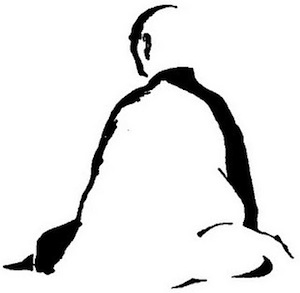
I will confess my blog looks the way it looks for lack of good interesting design not for a minimalist look. I have hired someone to enhance it, but they are a tad (3 months) behind. D’oh. I like your article and the monk b/w image.
I think it’s worth pointing out that a minimalist website has some advantages:
– They load quickly
– They are (usually) easy to navigate
– Information is presented clearly
– They are easier on the eyes
– They are more easily viewed on mobile devices
This is assuming it’s done well, of course.
I have always opted for a minimalist style as I am a huge fan of minimalism, although I have added illustrations and a splash of colour to my site so that it reflects my personality and work better.
Minimalist design has been around for a very long time (Bauhaus, Dieter Rams, Mies van der Rohe etc, etc), with web design being the latest incarnation, but as you quite rightly point out, minimalist does not have to plain.
Note to self: don’t use a cellphone to post comments!
I hear you, Richard. Once it’s posted, it’s posted.
But you did a fine job: you even managed a bulleted list!
I’ve only just started my blog (wish there was a different word, I don’t like that one!) and was a little worried that the overall look was too bare and blue, so have added pictures – thanks for the compfight.com tip. I think finding the right uncluttered image without and overdose of colour is helping … struggling to let go of the white, though!
Baby steps … baby steps! You can always make one tweak, live with it awhile, then try another. That allows you to move toward the changes little by little, and it’s also less jarring for your visitors.
Hi Pamela
Just to let you know that it WAS Leo – Zen habits as well as Mary at Goodlife Zen who inspired my minimalist design! They do it so well. But I am afraid it is perhaps over done in many blogs.
I have used just black and red and have to admit I am boring myself very quickly with the color palette.
Thanks for the challenge to us all!
No matter how minimal the website is designed it all depends on the visitors whom visit your website and what is your niche. Some niches will be nice with minimal designed website and some websites need to be professionally designed to attract more visitors whom might change to potential customers. So there are advantages and disadvantages of web designing. So, i feel it always depends on the individuals to determine and execute the right one.”)
Absolutely: you have to know what your target market will respond to: all design decisions should flow from that.
Thank you for outlining this tendency to ‘extreme minimalism’ in web design which has been a pet peeve of mine lately. But the challenge is really to give your copy the same degree of edge as your design, right? Personally, I tend to be a little on the formal side in an online environment with a lot of color. A difficult balance, I think.
Inger, I believe the real challenge is to write the best copy you can in a style that will speak to the audience you’re aiming for. Then you use design principles to put that copy on center stage so it gets the attention it deserves. It’s a tall order, but worth striving for.
Great article, Pamela. One thing that seems to make sense is to design your blog around the action you want your visitors to take. If you focus on that “one” action, you’ll see greater results. Case in point is Chris Brogan’s site update using the new StudioPress theme, Generate. This theme has one purpose… generate newsletter signups. It will be interesting to see how well it converts.
Yes: I’m very curious to see how Chris’s site redesign converts, too. I hope he reports his results after some time has passed.
Good advice, Pamela. But why didn’t you use color on the subheads of your post??
Pam didn’t do the design for Copyblogger. 🙂 We do use color, as you can see — there are red elements throughout. We chose to add it to other elements than the subheads.
Going through the redesign process myself a year ago, I can give a few tips that worked out great if you want a minimalist design.
1. Define minimalist. For me, it meant no adsense ads, no banner/column ads, no elaborate header, and a design where text was the focus while being able to easily visually separate out the different text areas of my site.
2. Start with a good minimalist theme. I grabbed a great one by Orman Clark.
3. Get a designer involved. I was lucky in that a designer helped me free of charge. We’d change the site here and there so it still had the major characteristics of the theme but added it’s own unique style. In my case, I went with a simple rounded-corner effect on everything.
4. Focus on the rule of 3 threes. No more than three fonts, three areas, three colors, etc. In my case, we focused a lot on the three colors; yellow, blue, and gray. There are in the logo and I wanted to make a clear part of my theme. Any other colors used were gradients of those colors.
5. Get the right profile photo. When I had my photo taken, I made sure I used a color that would look good with my site. Nothing dark, nothing too serious, and something that is clearly about the site topic. In my case, I was sitting on a desk with related stuff in the background.
6. Lastly, recognize that other people might have a similar theme with a similar look. The more common your theme, the more likely an issue. I’ve only seen one other site with the theme I used, in the same niche. They don’t have the tweaks and opted for a darker color compared to my lighter color choices. I don’t think the average visitor would see them as the same theme unless they compared theme side by side.
Creating a great minimalist design is like putting on a dark blue dress suit. It’s plain. Nothing about catches your eye. But, add the right colored handkerchief in the pocket and the right tie and POW, you’ve added a lot by adding a little.
This is a fantastic summary, Chris.
Copy/paste or print, cut out and put it where you can see it, folks. It’s a great to-do list for the new year!
The only place I’d veer from what you advise is in the rule of threes. I usually recommend sticking to two colors and two fonts if you’re not a designer. It’s easier to keep things cohesive looking when you pare down the fonts and colors.
I don’t include “colors” like black, grey or white, though, so your yellow, blue and grey site sounds like it follows that rule.
Minimalist is the only way to go for me. It’s the way I live, and all it means is “no clutter.” It doesn’t mean bland, and a minimalist approach can still have pop. In fact that’s the very reason why I like Genesis. At least, this is my conclusion from 6 months climbing the learning curve with my present blog.
I’m still in the process of setting up my new blog. The ONLY thing finished thus far are a number of draft posts. Everything else is in the pipeline. Since I can’t afford a designer just yet, I’m concentrating my efforts on my business plan. Non-techies like myself need to invest more of their time with the concepts and overall strategy than to go trying to tweak stuff without having a good feel for where you want to take your blog.
Having said all that, does anyone know of a good designer who can help me without breaking my (minimalist) budget?? The challenge I’m trying to wrap my brain around right now is how to get a good logo for the “generate” child theme that doesn’t seem to be designed to work with custom headers. All this stuff is way over my head.
I hope you get a response, Rodney.
The other place to look is in the StudioPress support forum: they have a list of approved vendors and you might find someone to help there.
Rodney, I’m not sure what your budget is, but here are some well-respected designers who work mostly (or exclusively) with Genesis.
Great post Pamela! I enjoy minimalist sites — yet I do find that many of them lack a certain level of character. My last two sites were minimalist….but then I kept fiddling with them to make them more distinctive. My current blog is a template that I’ve hardly changed. It is not “minimalist”; but it adheres to many of your suggestions (which is nice to see).
Have a wonderful new year, and I look forward to more of your posts in the future!
I’m fairly new to the world of web (been blogging about a year), and was well aware of the bare bones trend, and encouraged in that direction. Since my content and imagery are quite ‘colorful’, I choose to be an original and think outside the plain white box. I continue to get rave feedback on the look and ‘feel’ of the site. Thanks for a great post!
I managed to compromise and added artwork to sliders on my minimalist blog. I’m not Zen by any means;
I’m bright and colorful and not very organized but found color to be a complimentary way of staying away from boring web deign.
‘Give your site an edge’ – I have always liked the clean look of a white background. However I gave this a go using a cream background and I love the difference. Everything seems to pop now. I use a bit of puple and green, along with colourful images. I really am amazed at the difference. The cream seems to match the brick background I added recently as part of my newly updated profile image too. It looks planned (but it’s not). THANK YOU for the nudge to give my site an edge.
Just peeked, and I love it! Congrats for taking the leap, Jeanie. It looks great. 🙂
This article's comments are closed.