This is another addition to our ongoing series of tutorials and case studies on landing pages that work.
Jill Mitchell wants to increase awareness and sales of her one-of-a-kind French vintage objects that she sells on Etsy and Ebay. She also wants more visiblity and sales for her buying tours of Provence.
She doesn’t actively market her site, although she does enjoy a responsive newsletter following. She doesn’t have a handle on her site metrics — traffic, blog readership, click-through rate from blog to Etsy/Ebay.
Jill is flying blind. Let’s see how we can get these sales sailing.
- The Goal: Sell French tours and vintage gifts.
- The Problem: Not making enough sales.
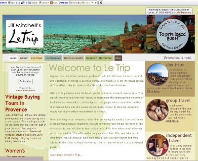
- The Current Landing Page (homepage): http://www.letrip.org
- Value: $39 — average gift sale
The Maven’s 10-Point Critique
#1 — Make sure all your main links work.
I usually save the tech tweaks and tuning for the #7-#10 slots and frontload the marketing suggestions, but in this case, I have to start here.

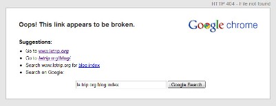
- When I was putting this makeover together, I got an error message when I clicked the blog link. You need to keep an eye on any issues like this and fix them pronto.
- When I did manage to get to your blog and clicked “Home,” thinking I’m going back to the main homepage, I don’t. I don’t go anywhere. You’ll want to clarify what HOME means on your blog. Add a “Go to Main Page” so your visitors don’t feel trapped. Trapped people lose the mood to buy.
- Make your main logo clickable to www.letrip.org
#2 — Be upfront, be clear as to the purpose of your site and what visitors can expect to find there.
If you want to sell your tours and vintage gifts, you need to be obvious. Say it (and show it) clearly and up front.
I had to spend more than a few minutes reading your homepage and clicking around to figure out that you offer specialty buying tours of Provence with the emphasis on vintage and antiques.
So let’s start there. You need to get the main idea: “LeTrip — Unique Buying Tours of Vintage Provence” or some variation into your headline. Your tagline can be a little more fun but still clear: “Let an American take you vintage shopping in Provence.”
You might also want to work in “Always a Guest, Never A Tourist” and any other descriptors that make sense for you and will be attractive and intriguing to your visitors.
#3 — Push your value proposition forward. Way forward.
I’m sure the competition for French tourism is intense, even in a recession. So you need to be clear (oops, she said it again) about what makes your tours so gosh darn magnifique as compared to other niche tours of Provence. What can you say about your tours that no one else can?
I noticed that your main site talks about wine tours, so you may want to broaden your approach to “Passionate Buying Tours of Provence: Great Wine — Vintage Gifts — Antiques” or whatever works best to capture what is special and unique about Le Trip.
#4 — Get your gift store info and links on the homepage.
Why segregate your gift businesses strictly to the blog, when you should be promoting them in all the spaces and places your visitors are looking?
I’d add an easy-to-see separate button to your current navigation bar with “Unique Vintage Gifts from Provence” and send folks to a separate page where you can highlight your gift items and direct them to your Etsy and Ebay stores.
#5 — Organize your navigation for visitor expectations. Make it easy for them to find what they need.
Why are your visitors there? They love Provence, want to visit Provence, wish they could see Provence. (And if they can’t, they’d like to purchase a little piece of Provence.)
Your navigation needs to reflect the information-seeking needs of your visitors, so I would make the following change:
Home — LeTrip Difference — LeTrip Tours — Upcoming Events — Brava! Meet Jill — Read Jill’s Blog — Contact Jill
Add a search box and a sitemap, too.
#6 — Put your key messaging into the strongest part of your homepage. Sidebars are for sweeteners.
Your best homepage real estate is being used for a long, sweetly worded ramble about Provence. Move that content to Le Trip Difference and start promoting your upcoming tours — the ones that pay you cash Euros — there instead! Give your visitors a tasty intro that will draw them deeper into the site for the rest of the information and reservation details.
Save your sidebars for secondary sweeteners. Add a rotation of testimonials here, or feature a “gift idea of the month.”
#7 — Organize your site for selling and telling. Use your blog to illuminate Jill’s personal style and take.
Following info links about tours, I’m sometimes directed to your blog and sometimes not — what’s up with that? I was confused and confounded. I have to imagine your average visitor would be, too.
So I’m strongly suggesting that you do a complete revamp of your internal site structure to make sure you keep visitors moving along a consistent, intuitive track on your main site.
A leads to B leads to C. (This, after fixing any link issues that might still remain, could be the most important recommendation of the entire Makeover.)
Use your blog to express your thoughts, your personality, your take on all things Provence. Your blog is where your clients and prospects get to know more about the person behind LeTrip. The more they know you, the better they’ll feel about taking a tour with you or buying from your stores.
#8 — Add those essential credibility boosters!
Strengthen your About Jill page with more facts. How long have you been in business? How many tours/people have you given since opening your doors? Are you a member of any travel/tourism associations? Your prospects want to know who they’re doing business with.
Also, provide a physical address in France. A P.O. Box is fine, but if you’re promoting your ex-pat lifestyle and business, I’d like to know you’re actually in Provence and not Passaic, New Jersey.
#9 — Lay the basic SEO groundwork to boost organic search engine rankings
You mentioned in your notes to me that you don’t understand SEO or how it works. There’s a ton of good info out there, but for now here’s what you need to do:
- Identify the words, terms, and phrases people might use to find your kind of services and products, and make sure you’re using that language in all your content.
- Make sure each one of your site pages has its own ‘meta’ title that front-loads the keyphrases before your company name. A homepage title might read like this: Vintage Buying Tours of Provence, France :: LeTrip.org. Your other pages would follow the same syntax.
- Make sure your blog uses best practices for SEO, as well. Check out Copyblogger’s own Scribe SEO for great assistance in this area, as well as our free resources on SEO Copywriting.
Don’t stop there, of course. Good SEO makes all the difference, and these few points will give you a good start.
#10 — Use social media to connect and grow your tour and gift businesses.
You have a tremendous opportunity to widen your prospect universe with social media. So add Facebook and Twitter to your marketing mix. Add the buttons, ask folks to connect with you, and start connecting with others who love Provence and all things vintage.
My thanks to Jill Mitchell for her patience and support of Heifer International. Look for my next makeover in approximately 3 to 4 weeks.
Want your own Copywriting Maven landing page makeover?
Got a landing page that’s more poop than pop? Need to get better results from your online marketing? If you’re interested in a private page makeover, site audit, or other services, please email Roberta directly.)


Reader Comments (33)
Well illustrated and nicely explained to reduce the bounce rate by creating a good landing page.
It’s also better to customize the 404 error page with the related posts saying that “what you are looking for is not here. Try these!”
And the use of social media icons will be helpful in sharing the the article on n/w sites so that other people get benefit from it
Oh, boy. This for sure is one more thing I’m going to have to read up on and learn how to do. Thanks for it!
Well, in any event, reading this makeover made me want to head over to LeTrip and buy some stuff/book some trips.
I’m with you, Sonia. My imagination was running over time.
@sonia LOL
Really great article especially number 2-4.
If I hadn’t read this post I may not have known what the main purpose was.
Roberta you kickassetts with these clinics!
@Roberta, is it me or is the homepage screaming for a Gary V type video explaining things?
I believe it would help.
@Darren – thanks, I come from a long line of kickasseters.
@Shane – I think a video would definitely add a boost, but folks need to be able to ascertain the point of the site within 2-3 seconds without watching a video.
Nice one, Roberta.
I agree that Jill’s blog could be a huge asset to her business just for showing who she is, while at the same time making sure she gets the business from people she would like too.
Dear Roberta
You are magnifique and so is the horse you rode in on! Really looking forward to implementing your concepts. Thank you for your support of Heifer Internation, also!
Salutations les meilleures!
Roberta,
Thank you so much for all of your great tips! I’m a tad confused, though;
Shouldn’t a true landing page really have just center column content, no sidebars-no links etc?
Like the one that’s linked to my name up above, and was helped along by a certain Third Triber?
Thanks,
The Franchise King®
Hi Roberta,
This is what I’m talking about. it’s from one of your earlier articles…
“Remove all extraneous matter from your landing page. This includes navigation bars, visual clutter, and links to other sections. You want the reader focused solely on your copy, your supportive visuals, and the offer you’re making without being tempted to wander around the room.”
The Franchise King®
@Joel, there are all sorts of landing pages. There are the center column, long-form sales letter types … squeeze pages … lots more. Website or blog home pages are another version of a landing page. Its job, however, is to drive visitors deeper into the site rather than generate an immediate sale or sign-up.
This is great! I love these make-overs! I wish I could be as niche as this so I could get a make-over
You are great Roberta! Thank you for sharing your amazing talent and knowledge.
@Farrah – when you need to sell something, you know where to find me. (Thanks for the kind words!)
@Roberta – I would love to hear more about those different types of landing pages, maybe an article on your own site?
Fantastic analysis. Very good points on how to optimise a landing page for increased sales.
Point 7 is a good one :
“Organize your site for selling and telling. Use your blog to illuminate Jill’s personal style and take.”
Translated : get rid of confusion and unnecessariness (I just made that word up, btw).
Cheers
Jamie
Hey Roberta
I strongly agree with your point #2 & #7 .
Anyway, other points are very true as well. Great post.
Thanks,
Dev
Hi guys,
I agree with point #10. Social Media will be a perfect place where you can find a Fan Base.
Kind regards,
Sam
X
Hi Roberta
Your tips are really helpful!
Why don’t you write some sort of book containing more makeovers? I think internet marketers would REALLY appreciate it!
Sincerely
Mario C.
Very nice post. Made me rethink the general style of the website. Over time I think it got a bit out of target range.
Thanks for the extra work
@Mario – you have close to 30 here – you need more?
@Uwe – I aim to please.
An excellent article as always Roberta.
It never ceases to amaze me how each month the landing page has completely different issues and solutions. I never fail to learn something that I can apply to my own situation.
Keep up the great work!
@Pat – thanks for the kind comment. From my vantage point, interestingly enough, I find that most of the problems and challenges I see are similar – it’s how those problems are expressed that are different. (Loved your Bettie Page inspired pin-up portraiture! When I grow up, I’d love to do portrait photography. Nothing is more interesting to me than the human face.)
Roberta, amazing critique. Your website is like a high performance car, you can tweak it which ever way you want it, but it has to qualify for the race.
Nice way of putting it, City!
Great information, thank you. Many of these pointers fall into a simple usability factor too.
Erika, absolutely. I think usability (broadly defined) is a foundational pillar to better conversion.
“be clear as to the purpose of your site ”
Isnt it amazing how many webmasters get this basic rule wrong? Theres nothing worse than hitting a site and thinking “I dont get it? What is this site about/offering???”
I met with a lady just yesterday that operated a homewares website. She was frustrated because she wasnt making any sales. After spending about 2 hours with her, it became obviously apparent that she had really underestimated whats involved in running a successful online business. When I returned to the office I had a look over her site and the homepage was so cluttered and confusing – all I could think was “No Wonder!”
Hi Roberta
Your tips are really helpful!
Why don’t you write some sort of book containing more makeovers? I think internet marketers would REALLY appreciate it!
This article's comments are closed.