Email marketing is one of the most popular marketing channels because it’s relatively easy to use, highly effective, and cheap.
Yet, implementing an email marketing strategy can feel overwhelming.
How do you get started? What kinds of emails should you send? What email marketing software should you use? What’s the difference between an average and highly effective marketing strategy?
This guide simplifies email marketing. Whether you’re a beginner or an advanced user, it covers everything you need to know to start a highly successful email marketing strategy with minimal time and effort.
Want us to
scale your traffic?
For the first time, The Copyblogger methodology is now available to a select few clients. We know it works. We’ve been doing it since 2006.
What Are The Benefits of Email Marketing?
If you’re still unsure if you should invest in email marketing, here are a few reasons why it’s a popular marketing channel and how it can help you grow your business.
1. Cost Effective
Email marketing requires very little upfront investment as the only startup cost is the price of the email platform you use, and many of the email platforms offer a freemium version of their product for entrepreneurs just getting started.
Often, the biggest costs involved with email marketing are acquiring email subscribers (though there are plenty of ways to earn email subscribers without running ads) and writing great email copy (though you can also write the emails yourself using our copywriting guide and eliminate that cost entirely).
2. Personal Communication
Another benefit of email marketing is that it’s a very personal form of communication as your message sits directly inside the recipient’s inbox, along with messages from friends and colleagues.
This personalized communication makes it much easier to build trust with subscribers, and depending on how well you craft the copy of your emails, you can establish a very personal relationship with customers at scale.
3. Owned Marketing Channel
A disadvantage of many marketing channels, like social media and even SEO, is that you’re reliant on an algorithm to show your content to followers and new prospects.
Yet with email marketing, you can ensure that each of your subscribers sees your emails as long as you maintain high engagement rates and avoid the spam inbox.
As a result, it’s much easier to pitch products and services through email than any other form of marketing, as you can nurture prospects and ensure they receive each message. It’s also much easier to track open rates and clicks through email marketing than tracking which visitors have viewed specific content on your website or across your social media channels. This data makes it easier to remarket appropriately.
A Simple Step By Step Guide to Email Marketing
To help you get started with email marketing, here’s a simple guide that anyone can follow to set up an email list and get started.
Step 1: Collect Email Addresses
Before you send emails, you need to collect email addresses on your websites.
There are plenty of strategies to earn more email subscribers, but to get started, create a form on your website to automatically collect email addresses.
Many email marketing software platforms offer landing pages and popups as part of their product. For example, ConvertKit allows you to create a landing page or embed a form on your website to collect email addresses:

Alternatively, you can use a tool like OptinMonster to create a popup or embed form on your website. OptinMonster also integrates with many email marketing tools.

Once you have an email popup in place, you need to create an incentive for people to opt into your email list, as most people will not join unless there’s a strong incentive to do so.
Therefore, create a lead magnet, like an ebook, a checklist, or a cheat sheet that would help your target customers and allow them to download it in exchange for their email address.
Here’s a great example of a lead magnet for a nature and wildlife photographer. After signing up for the ebook, subscribers receive a nurture sequence that eventually leads to a pitch for a course on wildlife photography.

Step 2: Build An Email Nurture Sequence
After someone joins your email list, it’s important to make regular contact with them. Otherwise, prospects will forget your brand and likely won’t open any emails you send them in the future.
The best solution is to create an automated email nurture sequence (sometimes called a welcome email sequence). An automated nurture sequence delivers prospects a series of emails over the course of several days.
For example, if you create a series of four emails in your nurture sequence and schedule users to receive them each day after they sign up, a user who signs up for your email list on Monday will receive an automated email on Tuesday, Wednesday, Thursday, and Friday.
This makes it easy for you to nurture prospects automatically.
So how do you build a nurture sequence?
Most email marketing platforms have a feature that allows you to set up a nurture sequence. Here’s what it looks like in ConvertKit:

Here’s an example of how you can actually write an email nurture sequence in ConvertKit. You’ll notice that this one has three emails, and each is scheduled to send one day apart.

Email nurture sequences are nice because you can set them and forget them. So, if you currently don’t have time to write emails each week, setting up a nurture sequence will at least help you get started and familiarize new prospects with your brand.
So, what content should you include in your email nurture sequence?
There isn’t a single correct answer to the type of content that you should include in your nurture sequences, though here are a few different templates you might want to consider:
- A step-by-step guide: It’s common for people to create nurture sequences that teach people one step of the process each day. For example, if you sell SEO services to local businesses, your nurture sequence could be a step-by-step guide to setting up your local SEO foundation.
- Multiple pain points: For this email sequence, identify the three most common pain points prospects face and then create an email on how to solve those problems. For example, if you sell SEO services, a common pain point is link building, so you could create one email in the sequence around link building.
Another question is how many emails should be in your sequence. While there isn’t a right or wrong answer to this question, three to five emails is a good range. Sending just one or two emails isn’t enough to build a relationship, and more than six or seven can overwhelm recipients (especially if you’re showing them a step-by-step process).
Step 3: Select An Email Style
Creating a single email nurture sequence is a great way to get started with email marketing, but not all prospects will convert in your initial nurture sequence.
To re-engage prospects who didn’t immediately convert, it’s a good idea to also send regular engagement emails.
There are three main types of emails:
- Email newsletters
- Educational emails
- Sales/promotional emails
Email Newsletters
These emails are ideal if you’re just getting started with email marketing and want a simple, easy way to provide value to your readers each week.
For example, here at Copyblogger we write a weekly newsletter that keeps readers up to date with the latest content across all of our platforms (the podcast, the YouTube channel, etc.).
Here’s an example of one of our weekly newsletters:

The benefit of sending a weekly newsletter is that you can use the same format each week, and it’s relatively easy to put together. A repeatable format also allows you to easily outsource the task of writing the newsletter to a freelancer.
Educational Emails
Email newsletters are easy to create and helpful for readers, though if you’re striving to deepen your relationship with prospects and convert them into customers, the best way to build trust is through education.
If you educate prospects and they see great results after implementing your tips, they’re more likely to trust you and ultimately purchase your products or services. In fact, even if readers don’t implement the strategies or advice you offer, simply showing them how you’ve helped others achieve great results and/or laying out a logical step by step solution will build trust that can lead to conversions.
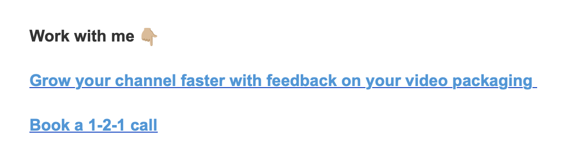
Tintin Smith is a great example of a YouTube producer who shares practical tips, new discoveries, and strategies regularly:

These types of emails are much more difficult to outsource because the effectiveness of these emails really depends on the effectiveness and originality of the tips, ideas, and strategies.
So even though these emails are often the most challenging to produce, they’re also usually the most effective.
If you have the time and energy to write these styles of emails, go for it, but if it’s too intimidating, get started with sending a simple newsletter.
Promotional Emails
If you’re selling a service or B2B product, use promotional emails more sparingly. However, ecommerce stores can use them more frequently, as customers usually value discounts over education.
The key to great promotional emails is less about the email copywriting itself and more about the design and the deals you’re offering.
Here’s a great example of an ecommerce email:

Step 4: Writing Your Email
The content within your email is one of the biggest factors influencing the success of your email campaigns, and there are two main components of this:
- The value provided/content idea
- The copywriting/delivery of that content
The most important aspect of an email is the value it delivers. “Value” can be either the idea you’re delivering (if it’s an educational email) or the discount you’re offering (if it’s a promotional email).
For an educational video, the value depends largely on:
- The relevancy of the pain point you’re content is solving: How painful is that problem to the reader? Is it the top problem they struggle with or a secondary or even irrelevant problem?
- The effectiveness of your solution: How fast, easy, and well does the solution you provide in the email solve the problem? For example, if you want to provide a solution to link building and the email is a list of websites that have agreed to give one link to any of your subscribers, that would be significantly more valuable than a list of tips on how to get links.
For a promotional email, the value is higher if the discount you’re offering is high and it’s on a product that your customers really want.
For a newsletter email, the value will be higher if it’s relevant, exclusive news that readers can’t find anywhere else and it’s delivered in a way that’s entertaining to readers.
The other part that significantly impacts a newsletter’s success is the copywriting itself.
While copywriting isn’t critical for ecommerce promotional emails, it has a big impact on the success of educational and even newsletter style emails.
What does great email copywriting look like?
Copywriting is an entire subject in its own right, and there isn’t a single right or wrong way to write an email. However, the main principle of great copywriting is clarity.
Therefore, use simple language, ideally at a fifth or sixth-grade reading level.
There are two main types of educational-style emails that work well. First, you can wrap your point into a story. Here’s a great example of an educational email wrapped in a story:

The other type of email that’s highly effective is simply telling the reader what they’ll learn by reading your email and then giving them step by step instructions (or even combining this with a story). Here’s a great example of this:

For newsletters, great copywriting is about creating an interesting point on why the news you’re sharing is noteworthy or how the reader can use that news to accomplish a goal.
For example, The Hustle’s newsletter tagline for many years was “My boss thinks I’m smart (I’m not). It’s because I read The Hustle.” Therefore, reading The Hustle was valuable because the news helped them accomplish their goal of performing better at work.

Therefore, your copywriting should answer the question of “How can users use this news?” or “How does this news help readers?”
You can also use your tone of voice or style of writing to make your news more interesting. Morning Brew is an excellent example of this:
Step 5: Create a Compelling Subject Line
Your email copy doesn’t matter if nobody clicks on your emails in the first place, so the key to getting them to click is to write a compelling subject line.
Just like writing email copy, there isn’t a single way to write a great headline. However, here are a few best practice tips to create a great subject line:
- Keep it short: Will the entire subject line show up on mobile?
- Introduce curiosity: Does it introduce any unanswered questions that they’ll feel compelled to click and get the answer?
- Relevancy: Make sure that the reader can clearly tell they’ll learn something of interest. If they can’t tell if it’s related to a topic they’re interested in, they probably won’t click.
Here are a few examples of great headlines that I personally clicked:


Step 6: Track Your Email Analytics And Improve
Once you start sending some emails, you’ll notice that some perform much better than others (e.g., earn more clicks, opens, etc.).
The key to improving your email marketing strategy is tracking which emails perform the best and then creating more similar emails.
So, what patterns should you be tracking?
As you look at your email marketing analytics, keep track of not only the subject lines that drive the best open rates, but also the topics that perform best and the tone of voice/writing style and format that drives the most engagement.
You can also ask your readers to share their biggest struggles. This information makes it easier to identify the most helpful content for future emails.

You can also add a poll at the bottom of each email:

Qualitative feedback is arguably the most valuable, as it helps you better understand who is reading your emails (are they your target audience?) and the problems they’re struggling with.
Exclusively using quantitative analytics to improve your email marketing strategy isn’t always helpful because you might have just a handful of people clicking on your emails. However, if they’re the right target audience, that’s still better than earning a lot of clicks from people who aren’t your ideal target audience.
Step 6: Establish A Consistent Send Frequency
Once you’ve started sending regular emails, the next step is to establish a consistent send frequency. For example, here at Copyblogger, we schedule our weekly newsletter to send on Friday mornings.
This makes it easy for subscribers to anticipate our emails, and it allows us to optimize the send time. For example, we could A/B test different days and times.
The biggest question people often ask is how many emails you should send per week.
The simple answer to this is as often as is effective.
In other words, watch your email engagement rates and increase your send frequency until you reach a point where email open rates begin to decline. However, if email open rates are stagnant or increasing, send more emails because the more touchpoints prospects have with your brand, the more likely they are to convert into customers.
You can also use a content calendar to plan out your emails for the month:

Step 7: Segment Your List
By now, you have a fairly solid email marketing strategy in place, yet you probably have different people coming to your website.
For example, some may be beginners to your topic while others may be more advanced. Additionally, there may be various subtopics within your industry and visitors may be interested in one specific subtopic.
For example, here at Copyblogger, we cover various marketing topics from email marketing and content marketing to SEO and personal branding. Additionally, some may be advanced email marketers whereas others are just getting started with email marketing.
Therefore, it doesn’t make sense to send everyone the same emails all the time as beginner content on email marketing won’t be relevant to a more advanced user, and someone interested in SEO might not want content on email marketing.
To solve this problem and increase engagement rates by only sending relevant content to the right people, consider segmenting your list.

Most email marketing software tools make it easy to create segments of different email lists directly inside the platform.
Email Marketing Tips
Once you have your strategy in place, here are some email marketing tips to help you take it to the next level.
Tip #1: Optimize Your Send Time
The time of day and the date you send your emails impacts open and engagement rates.
For example, sending your emails on Sunday mornings will probably result in lower engagement rates as people will likely be preoccupied with other more important emails when they come back to work on Monday.
However, the best time of day to send emails depends primarily on your target audience. For example, the best time of day to send an email for an ecommerce store might be on Saturday when customers are shopping online in their free time. In contrast, a B2B company would likely see better engagement rates sending emails on a Wednesday or Tuesday when people are active in their inbox but not overwhelmed.
Therefore, test a few different times of days and weekdays to discover what works best for you.
To get started, here’s some data from Campaign Monitor that suggests Thursdays might be a good weekday to test:

Tip #2: Scrub Your List
Email marketing is a great marketing channel because you can control who sees your content.
The only exception is if customers mark your emails as spam or you have very low engagement rates.
As a result, your emails may end up in the promotions tab, or even worse, the spam folder.
An easy way to keep engagement high is to scrub your list regularly and remove users who are no longer actively engaged.
If you need help scrubbing your email list, here’s a step-by-step guide that makes it easy.
Tip #3: Make Your Emails Mobile Friendly
Plenty of data shows that most people check their email on their phone, so it’s important to optimize your emails for mobile users.
If your emails are primarily text-based, this is fairly easy, but it’s more critical if you include images. For example, if you’re promoting a deal at your ecommerce store, the image must be optimized for mobile.
In this example from Campaign Monitor, you can see that the first image on the right is optimized for mobile and easy to read, whereas the second image on the left is not.

Most modern email marketing software solutions offer mobile responsive templates out of the box, so it’s pretty easy to optimize your emails for mobile. However, it’s still important to double check the layout before sending your emails and be mindful of any large images that could be distorted.
Tip #4: Promote Conservatively
The purpose of email marketing is ultimately to drive sales, so you’ll need to promote your products or services (or those of others if you’re monetizing through affiliate deals) at some point.
However, if every email is promotional, people will eventually quit opening your emails. Ideally, keep a ratio of about 4:1 value to promotion if you offer a B2B product or service. Ecommerce companies can promote a little more heavily as most customers opening ecommerce emails are specifically looking to purchase products rather than educational materials.
Note that you can always include a simple CTA and links to your products or services at the end of each email, as some people may want to make a purchase or proceed further in the sales process after reading an educational/value email. The key is to send emails that are primarily promotional sparingly.

Here’s another example:
Tip #5: Respond To Emails
A no-reply email is frustrating for customers that have a question about an order or product use case. If they can’t respond to the email, they’re more likely to simply churn or leave a negative review.
Additionally, an underrated method to increase email engagement and deepen relationships with your subscribers is to simply respond to emails.
If people can ask you questions, they’re much more likely to open your future emails because it will feel like they’re coming from a friend.
In fact, we include this at the end of each Copyblogger email:

You can also ask a more conversational question, like this one:

This question is more personal and conversational, which will help build trust with your audience.
Email Marketing Software
The success of your email marketing efforts depends primarily on the number and quality of your subscribers.
ConvertKit – Best For Creators And B2B
We use ConvertKit here at Copyblogger. It’s easy to set up different campaigns, sequences, and audience segments. ConvertKit offers plenty of templates for different businesses, but it’s primarily designed for creators.
Therefore, it’s easy to set up and use, and you can even build a simple landing page to start collecting emails if you don’t have a website.
You’ll also have access to detailed analytics to track performance, and it’s easy to scrub your list.
Another benefit of ConvertKit is its Creator Network. It allows you to find other creators with similar audiences with whom you can cross-promote your newsletter, which is a great resource for earning more subscribers.
Pricing

Klaviyo – Best For Ecommerce
Klaviyo is designed for ecommerce brands that need simple email marketing software. You can easily send abandoned cart recovery emails, order confirmations, and other types of emails specific to ecommerce.
It also offers basic email marketing features, like list segmentation and automation.
In addition to its email marketing suite, you can also send SMS and push notification campaigns. There’s even a feature that makes it easy to collect and publish reviews.
Pricing
Mailshake – Best For Sales Teams
Mailshake is an excellent email marketing platform for sales teams that need an easy platform to both send cold emails with personalized templates and manage responses.
You’ll also have access to all of the traditional email marketing features, like sequences and automation, as well as detailed analytics to A/B test different campaigns.
It also offers LinkedIn messaging automation features and can integrate with your cold calling systems.
Pricing

How To Earn More Email Subscribers
The success of your email marketing efforts depends primarily on the number and quality of your subscribers.
Therefore, here are a few of the most effective tips to earn more email subscribers, and you can learn how to execute each of them on our resource dedicated to the topic.
1. Improve The Relevancy and Value of Your Lead Magnet
The more valuable your lead magnet is to your subscribers, the more likely they are to download it and subscribe to your email list. For example, a lead magnet that offers a free tool that solves the problem for subscribers is likely more valuable than an informational piece of content discussing how they can manually solve a problem. You can read more about the nuances of improving your lead magnet’s value in our post on the subject of earning more email subscribers.
2. Optimize Your Website With Relevant On-Page CTAs
Where you include CTAs to subscribe to your email list on your website, and the number of CTAs impacts your email subscriber rate.
We recommend including a CTA inside each blog post, in the sidebar, and an exit popup.
3. Create A Subscriber Referral Program
You can offer rewards to subscribers for additional subscribers they help you earn. Most newsletters offer a tiered referral program where the subscriber earns a reward after a certain number of new people use their referral link to subscribe to your email list.
For example, if someone refers two new subscribers, they might earn a discount. If that person brings five new subscribers, they might earn a free gift.
4. Create Subscriber Exclusive Content
Many newsletters offer content that’s only available in their newsletter. For example, it could be a detailed strategy breakdown. Then, you can tease the exclusive content on social media to promote your email list and earn more subscribers.
5. Partner With Other Creators
If other creators already have your ideal target audience, you can partner with them to do a newsletter swap. For example, if you have a productivity course, you could partner with a creator who has an audience of meditation enthusiasts, as there’s often synergy between the two niches.
Similarly, if you’re a landing page platform, you could partner with a webinar platform, as people hosting webinars probably also need a landing page.
If you want more details on how to execute any of the promotion strategies mentioned above, check out our resource on how to earn more email subscribers, where we discuss how to execute each of them in more detail.
How To Get More Help With You Email Marketing Strategy
Email marketing can be overwhelming, but if you follow the steps in this guide, it’s fairly simple. If you’re not sure where to get started, sign up for an email marketing platform and then begin at step one, collecting email addresses.
If you need more help getting your email marketing strategy off the ground, consider signing up for the Copyblogger Academy.
Inside, you’ll have access to courses on various marketing topics, including email marketing, SEO, content marketing, and personal branding. Additionally, you can network with other peers building their businesses and side hustles through digital marketing and have direct access to the team behind Copyblogger.
So in addition to the course material, you’ll be able to ask seven figure entrepreneurs, Tim Stoddart and Charles Miller for direct feedback on your email strategy and receive accountability with monthly accountability calls.
You can sign up risk free today at The Copyblogger Academy, and if you aren’t 100% satisfied, we’ll give you a full refund in the first 30 days.
This article's comments are closed.